27-Inch 4K vs 1440p for Code: When Windows Scaling Wastes the Sharp Panel

Nate Osborn
September 21, 2026
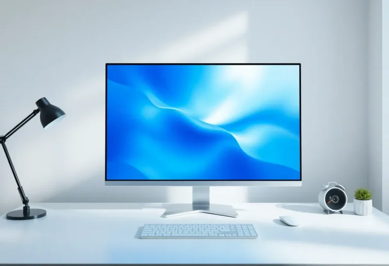
A 27-inch 4K panel looks like the grown-up choice for coding: more pixels, sharper fonts, room for the IDE chrome without everything feeling cramped. Then Windows scaling turns that sharpness into a soft, slightly wrong version of a 1440p experience—or into tiny UI you squint at until you give up and drop to 150% and wonder what you paid for. The decision is not “is 4K better.” It is whether your OS, GPU, and eyes will actually use the pixels.
This is a desk decision for people who stare at text all day, not a gaming refresh-rate shootout.
What 1440p at 27 inches already gets right
2560×1440 on a 27-inch panel sits near a comfortable pixel density for many developers: clear enough that fonts look intentional, large enough that 100% scaling in Windows or macOS still works. You can run an editor, a sidebar, and a terminal without living in fractional scaling hell. Games and creative apps that assume integer-ish layouts behave. Docking a laptop is boring in a good way.
1440p also taxes the GPU less if you ever share the machine for light creative work or a game after hours. For pure coding, GPU load barely matters—but cable bandwidth, dock chips, and laptop heat still do when you drive a sharp panel for eight hours.
If your current pain is “not enough width for the file tree and the editor,” 1440p at 27 inches (or a good ultrawide) often fixes it without introducing a scaling project. Buy the layout fix, not the marketing sharpness.

What 4K promises—and what scaling steals
4K at 27 inches is dense. At 100% scaling, UI elements shrink. Many people find the text “sharp but small,” which is another way of saying you will raise scaling. At 150% on Windows, logical resolution drifts toward something like a 1440p-ish workspace with uneven results: some apps blur, some stay crisp, cursors and borders look inconsistent. That is the waste: you bought a sharp panel and then asked the OS to invent a middle size it does not love.
macOS Retina handling is smoother for many apps, which is why 4K / 5K screens feel more natural in that ecosystem. On Windows, fractional scaling has improved and still leaves Electron apps, older native tools, and some IDE themes looking soft or oddly padded. If your daily driver is VS Code plus a browser plus a terminal, test that trio on the exact scaling you would use before you commit.
Linux compositors vary wildly. If you live in a tiling WM with mixed DPI, 4K can be either gorgeous or a weekend of configuration. Be honest about which weekend you are signing up for.
When 4K is worth it for code
Choose 4K at 27 inches when:
- You will run at a scaling factor your stack renders cleanly (often 200% on platforms that treat it as Retina-like, or a carefully validated 150% with apps you trust).
- You care about font edges and UI polish enough to notice 1440p’s limits.
- Your GPU/dock drives 4K at a stable refresh without turning the laptop into a heater.
- You sometimes edit images or read dense PDFs where density helps more than pure IDE layout.
Photographers who code on the side often prefer 4K for the non-code half of the day. Pure backend folks often do not recover the cost in joy.
When 1440p is the sharper decision
Stay at 1440p when you want 100% scaling, predictable app layouts, and a desk that just works after a reboot. Stay when you already know fractional scaling made you irritable on a laptop. Stay when the budget difference funds a better arm, a vertical secondary, or a UPS—tools that change failure modes more than pixel counts do.
Also stay when you sit farther from the screen. Density advantages shrink with distance; layout and ergonomics dominate. A sharp panel you lean into all day is a neck problem wearing a resolution sticker.
Mixed setups and the “wasted sharpness” tell
You will know Windows wasted the panel if you catch yourself thinking “this looks like my old monitor, but blurrier in places.” That is fractional scaling tax. Mitigations exist—per-app settings, avoiding 125%, preferring 200% where possible—but they are work. If you do not want that work, 1440p is not a compromise; it is the coherent product.
If you dual-boot or mix a sharp external with a soft laptop panel, expect more annoyance. Mixed DPI is a separate tax on top of 4K’s scaling story.
A practical try-before-you-buy loop
Borrow or buy with a return window. Set the scaling you would actually use for a full workday—not the 100% screenshot that looks impressive in a store. Open your real IDE theme, your real terminal font, your real browser zoom habits. Read code for two hours. If you never fight the UI, 4K won. If you lowered scaling then raised font sizes then blamed the theme, you are recreating 1440p the hard way.
Font rendering and themes change the math
Resolution debates ignore how much theme choice and font hinting affect perceived sharpness. A muddy IDE theme with low-contrast gray on gray will look soft on any panel. A crisp light theme with a well-hinted monospace font can make 1440p feel premium. Before you upgrade pixels, spend an evening on font size, line height, and contrast. Many “I need 4K” tickets are actually “my theme is tired” tickets.
ClearType tuning on Windows and font smoothing on other OSes matter more at 27 inches than people admit. If you never touched those settings, do that on your current monitor first. You may steal enough clarity to delay the purchase—or confirm that you truly are density-limited.
Laptops, docks, and the hidden 4K tax
Driving 4K from a thin laptop through a cheap dock is where the dream dies quietly: limited refresh, intermittent blackouts, fans spinning up during a Zoom call because the display pipeline is doing more work than your compiler. 1440p leaves headroom. If your coding machine is a 14-inch ultrabook, prefer the resolution your dock can sustain for a full workday without thermal drama.
Desktop towers care less. A modern GPU shrugs at 4K desktop usage. The scaling story remains the boss fight, not the rasterizer.
Price, panels, and what else the money could buy
The gap between a solid 27-inch 1440p IPS and a 27-inch 4K IPS often funds a monitor arm, a better keyboard, or a UPS for the workstation. Those purchases change comfort and uptime. 4K changes pixel density—if and only if scaling cooperates. Rank the pain: neck angle, random power blips, and blurry fractional UI are different classes of problem. Buy the fix for the class you have.
Decision rule
Ask: will I run this panel at a scaling factor that keeps text crisp in my real apps?
If yes, 4K at 27 inches can be lovely for code. If no—if you already know you need a mushy middle percentage—buy 1440p and spend the savings on the arm, the chair, or the second screen that holds logs. Sharpness you cannot use without blur is not sharpness. It is a sticker on a box that made your fonts worse.
27-inch 4K is a density product. 27-inch 1440p is a layout product. Coding is mostly layout plus readable text. Pick the product that matches the constraint you feel today, not the one that wins a pixel spreadsheet.
And if your OS is Windows and your patience for per-app scaling quirks is low, default to 1440p unless you have already tested 4K at your preferred scale with your exact toolchain. The forum thread that says “4K is fine now” is not sitting in your chair. Your eyes and your IDE build are.