Why SaaS Onboarding Still Leaks New Users at the Same Old Places

Nathan Cole
July 7, 2026
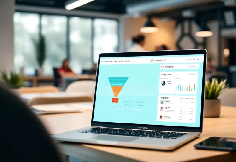
There are specific places where SaaS products lose users during onboarding. These places are not secrets. They’ve been written about, analyzed in product teardowns, presented at SaaStr and Product-Led Growth Summit for years. The playbook for fixing them is reasonably well-documented. And yet, if you go sign up for a dozen new SaaS products today, you will encounter the same failures in roughly the same order that you would have five years ago.
The knowledge exists. The discipline to apply it consistently does not. This is partly a team structure problem, partly a prioritization problem, and partly a fundamental misunderstanding of what users experience versus what the product team believes they experience. Let’s be specific about where the leaks are and why they persist.
The Verification Email That Starts the Clock Wrong
The signup flow ends and the user is sent a verification email. This is a necessary security step. But what happens next is the first common mistake: the product shows the user an empty state and waits for them to verify before letting them do anything useful. Or it sends them to a “check your email” dead-end screen with no further context about what the product will do for them.
Every minute that passes between signup and the user’s first experience of value is time for the decision to reconsider. People signing up for a SaaS product are rarely fully committed at the signup moment. They have an interest, a problem they hope to solve, and a willingness to invest some time in evaluating. That evaluation begins the moment the signup button is clicked, and the product’s job is to start demonstrating value before that window closes.
Products that handle this well show a demo, a setup preview, or a guided first-step experience while verification is pending. They make the verification email compelling enough that opening it feels like a step toward something, not an obstacle before something. Dropbox’s “here’s what you can do with Dropbox” experience, which didn’t block on verification, was influential here for good reason. The user was interacting with the product, experiencing it, while the account formalities resolved in parallel.
The Empty State Nobody Designed For
This is the most common onboarding failure mode, still. The user completes signup, lands in the product, and sees: a blank dashboard, an empty table, zero items, a sea of gray placeholder cards with “create your first [X]” scattered across them.
Empty states require the user to immediately understand what the product does, how to get started, and why the initial investment of time is worth it — all from nothing. Most users aren’t willing to do that work. They didn’t sign up to figure out your product; they signed up to solve a problem. If the product doesn’t immediately start helping them toward that solution, they close the tab.
The fix — pre-populating with sample data, showing a guided first-step flow that gets them to something real within 5 minutes, or displaying a short contextual explanation of what to create first — is well understood. The reason products still ship with blank empty states is usually that the empty state is one of the last things built and one of the first things deprioritized under launch pressure. The team has been looking at a populated test account for months; the empty state is something users see, not something developers see.

The Feature Tour Nobody Finishes
Product tours — the modal overlay sequences that say “Welcome to [Product]! Let me show you around” followed by a series of tooltip callouts pointing at features — have a completion rate problem. Published data from various onboarding analytics providers consistently shows completion rates below 20%, often well below, for multi-step product tours. Users dismiss them at the first opportunity, click “skip tour,” or simply ignore the tooltip bubbles while looking for the thing they actually came to do.
The persistent survival of the feature tour in SaaS products is partly inertia (onboarding tools make it easy to build them) and partly a mismatch between what the product team thinks new users need and what new users actually need. A feature tour assumes the user wants a product overview. Most users don’t want an overview; they want to accomplish a specific thing. The tour is about features; the user cares about outcomes.
The better approach is task-based onboarding: identify the single most important action a new user should take (the activation event — the moment that correlates most strongly with them becoming an active user) and focus the entire onboarding experience on getting them to that moment as quickly as possible. This might be “connect your first data source” for an analytics product, “invite your first team member” for a collaboration tool, or “schedule your first post” for a social media tool. Strip everything else. A progress bar with one item is better than a feature tour with twelve.
The Moment After Activation Nobody Planned
Suppose the product successfully gets a user to their first “aha” moment — they’ve connected their data, created their first project, sent their first message. What happens next? For a surprising number of products, the answer is: nothing. The user reaches the activation milestone and then gets dropped back into the main product experience with no guidance about what to do next.
The moment immediately following activation is when the user’s interest is highest and their context is most current. It’s the ideal moment to introduce the second most important feature, suggest the next meaningful action, or show how to invite collaborators who would make the product more valuable. Most products miss this moment because onboarding was designed to get users to activation — full stop. What happens after activation was handled by “users will figure it out,” which they often don’t.
The well-designed version of this is a graduated engagement curve: small wins that build on each other, with each step surfaced at the right moment. The user connects data → immediately shown what a visualization of their data looks like. User creates first project → immediately shown how to add team members. User schedules first social post → immediately prompted to connect their second channel. The actions are logical next steps, surfaced when they’re most relevant, rather than all dumped in a feature tour at the start.
Onboarding Emails That Arrive at the Wrong Time
The standard SaaS onboarding email sequence looks roughly like: immediate “welcome, verify your email,” then a “tips to get started” email 24 hours later, then a “have you tried [feature X]?” email at day 3, then “here’s a case study” at day 7. The problem with this sequence is that it’s based on calendar time, not behavior. It has no connection to what the user has actually done in the product.
A user who activated on day one and is actively using the product daily doesn’t need the “get started” tips email at day 3 — they’re past that. A user who signed up, looked at the empty dashboard for 2 minutes, and hasn’t returned needs a very different email than a user who is actively using the product but hasn’t discovered the integrations that would make it more valuable. Sending the same email sequence to both users wastes the engaged user’s attention and fails to address the disengaged user’s actual barrier.
Behavior-triggered emails — sent based on what users have or haven’t done in the product — consistently outperform calendar-based sequences on opens, clicks, and conversion metrics. “You created your first project but haven’t added any team members yet” is a more relevant message than “here are tips for adding team members.” The infrastructure to do this exists in tools like Customer.io, Intercom, and Klaviyo and has been accessible to even small teams for years. The reason most SaaS products still use calendar-based sequences is that behavior triggers require instrumenting the product and defining the right events, which requires engineering time and product clarity that many teams defer.
Why the Same Mistakes Keep Happening
Onboarding quality is a product management and prioritization problem as much as a design or engineering problem. The features that get built and prioritized are typically ones that existing, paying customers request or that sales says would close deals. New user onboarding doesn’t have a customer constituency who asks for it — the users who have a bad onboarding experience usually just leave, silently, without telling you why. The people who could tell you what’s wrong are gone before they can.
This creates a structural underinvestment in onboarding that persists even at mature companies. The team that owns onboarding is usually small or distributed across product areas. The attribution of new user activation to specific onboarding changes is hard to measure cleanly. The incentives point toward features, not to fixing the flow that existing users don’t see.
The teams that do onboarding well tend to have someone whose singular focus is activation metrics — not signups, not MAUs, but the conversion from signup to activated user. They have access to session recordings, funnel analytics, and user interviews specifically about the signup-to-activation experience. They run experiments continuously and ship small changes rather than waiting for a big onboarding redesign. And they treat new users not as potential power users who need to learn the product, but as skeptical evaluators who need to be shown value quickly, or they leave. That reframe changes what gets built and what gets prioritized.