Kindle Paperwhite vs Kindle Colorsoft: Is Color Worth Paying For on a Reading-Only Kindle

Clare Voss
October 14, 2026
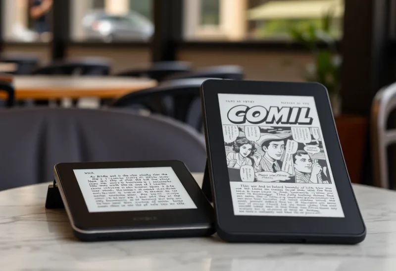
The first time you see a Kindle Colorsoft in a shop, the colour is the whole pitch. Book covers look like book covers again. Comics have colour. Highlights come in yellow, blue, pink and orange. Next to it, the Paperwhite looks like what it is: a very good black-and-white screen.
Then you take one home and read a novel on it for a week, and the question changes. Not “is colour nice?”, but “does colour make my actual reading better, and is it worth what it costs in sharpness, battery and money?” I have carried both on trips and used both for months of ordinary reading. The answer depends almost entirely on what you read.
Paperwhite for novels, Colorsoft for comics
If you mostly read novels and non-fiction, buy the Paperwhite. Text is slightly crisper, the battery lasts longer, and it costs less. Colour adds almost nothing to a page of prose.
If you read comics, graphic novels, manga with colour pages, children’s picture books, or cookbooks and travel guides with photos, the Colorsoft is the only Kindle that does them justice. And if you highlight a lot, colour-coded highlights are a genuinely useful extra.
Same Kindle, different screen
Both are 7-inch Kindles with the same basic shape, waterproofing and access to the Kindle store and Kindle Unlimited. The Paperwhite has a black-and-white E Ink screen at 300 ppi. The Colorsoft adds a colour filter layer: text and black-and-white content still render at 300 ppi, while colour renders at a lower resolution, as on every colour e-ink screen of this generation.
Amazon sells the Colorsoft in more than one version, including a Signature Edition with more storage, wireless charging and an automatic front light, and a lower-priced standard model. Exact prices and line-ups change with sales and new releases, so check the current options, but the Colorsoft costs meaningfully more than a Paperwhite at every tier.
| Kindle Paperwhite | Kindle Colorsoft | |
|---|---|---|
| Screen | 7-inch black-and-white, 300 ppi | 7-inch colour; 300 ppi black-and-white, lower resolution in colour |
| Text sharpness | The best on a current Kindle | Very good, slightly softer |
| Colour content | Shown in greyscale | Muted colour, like printed paper |
| Highlights | One style | Several colours |
| Battery life | Longer | Shorter, still weeks |
| Price | Lower | Higher |
| Store and library | Same Kindle store, Kindle Unlimited and Libby support | Same |
What colour e-ink actually looks like
Colour e-ink is not a tablet screen. It is closer to newspaper print: soft, muted colours that look best in good light. A comic on the Colorsoft is clearly in colour, and a cover is recognisably the cover, but nothing glows or pops the way it does on an iPad. If you expect tablet colour, you will be disappointed. If you expect “a coloured printed page”, you will be pleased.
The front light matters more on colour e-ink. The colour layer absorbs some light, so the Colorsoft’s screen looks a little darker than the Paperwhite’s in dim rooms, and you will use the front light more often. Outdoors in daylight, colour looks its best, because e-ink is reflective and bright light makes the colours more vivid, not less.
The cost of colour for text
This is the part reviews tend to skip. Adding a colour filter on top of the display slightly reduces contrast for plain black text. Side by side, the Paperwhite’s text looks a bit blacker and crisper on a whiter background. On the Colorsoft, the background has a faint tint and text edges are a touch softer.
Is that noticeable? Next to each other, yes. On its own, after a few days, most people stop noticing. But if you read novels for hours at a time, the Paperwhite is the more comfortable screen for pure text, and that is what most Kindle owners read most of the time.
Battery life follows a similar pattern. Both last for weeks of normal reading. The Colorsoft simply lasts less long than the Paperwhite, partly because you tend to run its front light brighter. For most people, charging every few weeks instead of every several weeks makes no real difference. For long trips without a charger, it is worth knowing.
Where colour earns its price
Comics and graphic novels. This is the strongest case. The Kindle store and Kindle Unlimited carry a large comics catalogue, and on a Paperwhite they are greyscale, which flattens colour-coded art into shades that are hard to tell apart. On the Colorsoft they look like comics. A 7-inch screen is still small for a full comic page, and you will use panel view for detailed pages, but colour makes them enjoyable rather than just readable.
Children’s books and illustrated non-fiction. Picture books, cookbooks, travel guides, and science books with diagrams all benefit. Charts with colour-coded lines become readable instead of guesswork.
Highlighting. If you highlight heavily, colour-coded highlights are surprisingly useful: one colour for quotes, another for ideas to follow up, another for vocabulary. Kindle’s notes and highlights export keeps the colours, which helps when you review them later.
Book covers and browsing. Colour covers make the library easier to scan, and your shelf looks like a shelf. It is a small pleasure, and some people value it more than they expect.
Where colour is wasted
For a typical novel, colour shows up exactly once: on the cover. After that, every page is black text on a background, which the Paperwhite shows better. If your reading is 90% fiction, you would be paying more, getting slightly softer text and shorter battery life, all for nicer covers.
The same is true if most of your books come from outside Amazon. Colour does not change how a Kindle handles EPUB files, library loans outside the US, or books bought from other stores, which are often the bigger deciding factors. If those matter to you, the comparison of the Kindle Paperwhite and the Kobo Clara BW is the more important one to read first.
Early quality issues
When the first Colorsoft shipped in late 2024, some owners reported a yellowish band along the bottom edge of the screen, and Amazon paused shipments while it addressed the problem. Units made since then should be fine, but it is worth checking the bottom of the screen in the first days you own one, while the return window is open. That advice applies to any new e-ink device, but especially to a first-generation colour screen.
Is colour on a Kindle better than colour elsewhere?
The Colorsoft is not the only colour e-reader. Kobo, Boox and PocketBook all sell colour models built on similar display technology, and the screens look broadly similar. The Colorsoft’s advantage is the Kindle store, Kindle Unlimited’s comics, and Amazon’s polished software. Its disadvantage is the same one every Kindle has: books from outside Amazon are more awkward to get onto it. If you are still deciding whether colour e-ink suits you at all, the reasoning in Kobo Libra Colour vs monochrome applies equally to Kindles.
Getting the most out of either screen
Whichever Kindle you choose, a few settings make a real difference, and they matter more on the Colorsoft because its screen is slightly darker and softer.
- Turn up the font weight. Kindle’s font settings include a boldness slider. One or two steps heavier makes text noticeably crisper on both, and it largely cancels out the Colorsoft’s slightly lower contrast.
- Use the warm light at night, but not too warm on the Colorsoft. A very warm front light tints the colour layer and shifts colours towards orange. For comics in the evening, keep warmth moderate.
- Turn on page refresh if you see ghosting. E-ink can leave faint traces of the previous page, especially after images. Refreshing the screen on every page turn costs a little battery and removes them, and it helps most with comics on the Colorsoft.
- Try the colour settings. The Colorsoft lets you adjust how colour is rendered. A more saturated mode suits comics; a softer one is easier on the eyes for covers and highlights.
- Use dark mode carefully on colour. White text on black works well on the Paperwhite. On the Colorsoft it is fine for text, but colour images look odd inverted, so many people switch it off for illustrated books.
None of these change which device suits you, but they close much of the gap in text quality, and they are worth the two minutes on day one.
Check your last ten books
Stay with the Paperwhite if:
- You mostly read novels and text-heavy non-fiction.
- You want the sharpest text and the longest battery life on a Kindle.
- You read in dim light a lot and prefer a brighter-looking background.
- You would rather spend the difference on books.
Pay for colour if:
- You read comics, graphic novels or colour manga, especially through Kindle Unlimited.
- You read illustrated books, cookbooks, travel guides or children’s books with your kids.
- You highlight a lot and would use colour-coded highlights.
- You read outdoors often, where colour e-ink looks its best.
A quick test before you decide: look at the last ten books you read. If more than two or three were comics or heavily illustrated, the Colorsoft will feel like an upgrade every week. If they were all novels, the Paperwhite is the better Kindle for you, and you will not miss the colour after the first evening.