How Open-Source Fonts Became the Default for Digital Product Design

Finn Mercer
July 7, 2026
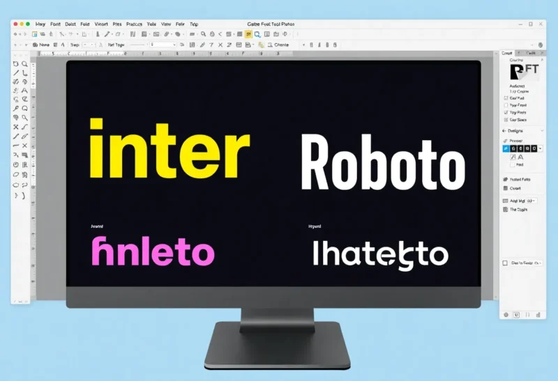
If you’ve used the internet in the past decade, you’ve almost certainly read text set in an open-source font without knowing it. Inter, Roboto, Noto, Source Sans, IBM Plex, and dozens of others are now the standard typographic infrastructure of digital products — used in apps, websites, operating systems, and developer tools at a scale that dwarfs the reach of any licensed commercial typeface. This shift happened gradually over roughly 15 years and was driven by a combination of practical necessity (web licensing economics), platform standardization (Google Android requiring free fonts, Google Fonts distribution), and the arrival of genuinely excellent open-source typefaces that compete on quality with their commercial counterparts. The result is a typographic landscape of digital design that would have been unrecognizable to a print designer in 2005.
The Problem That Open-Source Fonts Solved
Commercial typefaces have historically been sold under licenses that restrict redistribution. Embedding a commercial font in a printed document is generally permitted; serving that font to thousands of simultaneous website visitors over the web involves technical redistribution that commercial font licenses often didn’t clearly permit, didn’t price for, or required expensive web-specific licensing tiers. In the early web era, the practical solution was to use system fonts — the typefaces pre-installed on operating systems. This is why websites of the early 2000s looked typographically homogeneous: the available fonts were essentially Arial, Times New Roman, Georgia, and a handful of others that appeared on both Windows and Mac.
Web fonts (serving font files to browsers via CSS @font-face) became practical around 2009–2010 as browser support stabilized. The commercial font industry developed web font licensing models — services like Typekit (now Adobe Fonts) and Fonts.com offered subscription licensing. These worked for publishers with design budgets; they created friction for independent developers, open-source projects, and applications where font costs needed to scale with server load or distribution volume.
Google Fonts (launched 2010) addressed this problem by providing a library of open-source fonts free to use for any purpose — personal, commercial, web, app — with no licensing fees, no tracking users, and simple CDN distribution. The initial library was modest in quality and breadth, but the no-friction model drove massive adoption. By making the licensing question disappear entirely, Google Fonts enabled developers to use attractive typography without navigating commercial font agreements.
The Fonts That Defined the Era
Several open-source typefaces have become so dominant in digital product design that they’ve shaped the visual language of the web itself:
Roboto was designed by Google specifically for Android (launched 2011) and became the default typeface across the Android operating system and Material Design. With over 1 billion Android devices in circulation, Roboto achieved typographic ubiquity that few commercial fonts have ever matched. It’s a geometric grotesque sans-serif — clean, neutral, and optimized for screen legibility at small sizes. Its ubiquity across Android makes it the first typeface billions of people encounter every day on their phones.
Inter was designed by Rasmus Andersson (a designer who has worked at Spotify and various other tech companies) and released in 2017. It was specifically designed for high legibility at small sizes in user interfaces — with features like tall x-height (which improves readability at screen sizes), careful spacing, and an extended character set covering most Latin-script languages. Inter has become arguably the default typeface for digital product design: it appears in countless apps, websites, and design systems. Figma uses Inter as its UI font. Many design systems from independent companies default to Inter. It achieved this status through genuine quality rather than corporate standardization — designers chose it because it works well.
Noto is Google’s project to create typefaces covering every Unicode character — its name comes from “no tofu,” the engineering term for the blank rectangles that appear when a font lacks a glyph for a character. Noto covers over 1,000 languages and scripts, making it the most comprehensive free typographic system available. It’s less aesthetically distinctive than Inter but operationally essential for international digital products that need to display text in diverse scripts.
IBM Plex was designed by Bold Monday for IBM and released in 2017 under the SIL Open Font License. It includes serif, sans-serif, mono, and condensed variants — a complete type family released for open use. IBM Plex has been widely adopted in developer tools and technical documentation, where its monospace variant in particular became popular for code display.
How Font Quality Changed
The early critique of open-source fonts — that they were functional but aesthetically inferior to commercial typefaces — was largely accurate for the first generation of widely-used open-source fonts. Fonts designed by committees, by engineers rather than type designers, or as free alternatives to specific commercial fonts often lacked the optical refinements, consistent spacing, and character set completeness of fonts from established type foundries.
This criticism has become much less valid for recent open-source fonts. Inter, IBM Plex, and several others were designed by professional type designers working with explicit design goals for digital contexts. The tooling for type design improved significantly (Glyphs, RoboFont, and other modern tools lowered production costs and improved quality control), and corporate investment — Google, IBM, and others funding high-quality open typefaces as infrastructure — brought serious resources to open-source type design.
Variable fonts, introduced in the OpenType 1.8 specification in 2016, further expanded the capabilities of open-source fonts. Variable fonts encode multiple instances of a typeface (different weights, widths, optical sizes) in a single file, with interpolation between values. The practical benefit for web use: one font file that can render at any weight across a continuous range, reducing the number of separate font files needed and enabling typographic effects previously requiring multiple font files. Major open-source fonts including Inter and Roboto are now available as variable fonts.
What Commercial Fonts Still Offer
The rise of excellent open-source fonts hasn’t eliminated the market for commercial typefaces — it has clarified what commercial fonts need to offer to justify licensing costs. For high-visibility brand use — a company’s primary wordmark, packaging, flagship marketing materials — a custom or exclusive commercial typeface differentiates visual identity in a way that a commonly-used open-source font cannot. When Inter or Roboto appears in thousands of products, using them doesn’t signal distinctive design; using a less common or custom typeface does.
Commercial type foundries also offer design support, custom character development, extensive language coverage for specific regional markets, and licensing models for complex use cases (broadcast licensing, hardware embedding) that open-source licenses handle differently. For specialized typographic requirements — specific script support, particular aesthetic requirements, or brand exclusivity — commercial fonts remain relevant.
But for the majority of digital product design work — apps, websites, dashboards, developer tools, internal systems — the practical answer to “what font should we use?” has shifted from a licensing and budget question to a pure quality and fit question. The best freely available fonts are good enough that many products have nothing to gain from paid alternatives. That shift in what the baseline is represents one of the more quietly significant changes in digital design infrastructure over the past decade.