A Second Screen for a Single Editor vs Spreading the IDE: When the Extra Panel Splits Focus

Nate Osborn
September 21, 2026
The second monitor pitch is always the same: more space, more productivity. The failure mode is quieter: you spread the IDE across two panels, then fill the gaps with chat, email, and a browser that never quite leaves. What began as “room for the editor” becomes a permanent split of attention. Sometimes the extra panel should hold one editor’s supporting panes. Sometimes it should stay empty—or stay off—because the real constraint was focus, not pixels.
This is not the wattage argument about leaving a screen on 24/7. It is about whether a second display helps a single editing job or fractures it.
What “a second screen for a single editor” means
Used well, the secondary panel is subordinate. The primary holds the file you are changing. The secondary holds something the editor needs but should not steal the cursor forever: documentation, a running app, a test output stream, a design comp, a diff of a related module. You glance, you return. The geometry says hierarchy: one stage, one wingspace.
That setup can be brilliant for frontend work (preview beside code), for API work (docs beside implementation), and for refactors (old module beside new). The second screen has a job description. When the job ends, you can blank it.
What spreading the IDE usually becomes
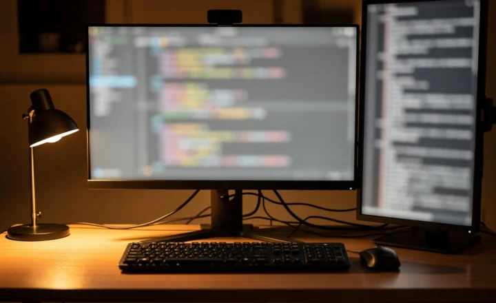
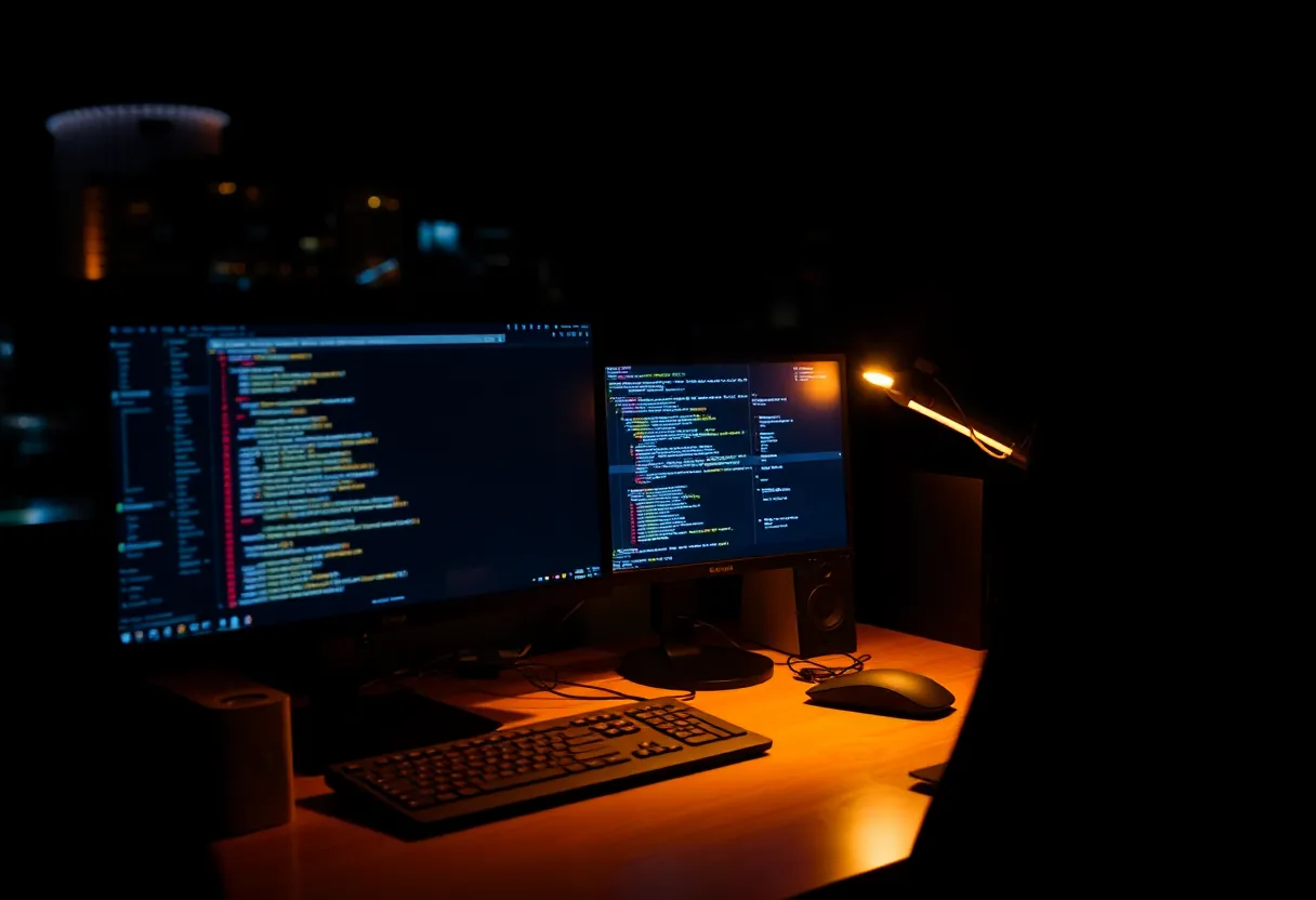
Spreading the IDE means file tree on one panel, editor on the other, terminal somewhere, preview somewhere else—until the “IDE” is a landscape of chrome with no center. Every glance jumps a foot of desk. Your neck tracks UI, not thought. Adding Slack to the remaining strip finishes the trap.
People defend this layout because it photographs as serious. It feels like infrastructure. It often measures as slower context return: where was the cursor, which file was focused, which panel had the error. One large primary with disciplined splits inside the IDE frequently beats two primaries that share custody of the same application.
If you already use an ultrawide, spreading further onto a second landscape can be especially redundant. You may be buying distraction, not width.
Focus is a layout property
Attention research jargon is optional. Desk experience is enough: anything continuously visible competes. A second screen that always shows something “useful” trains interrupt scanning. Useful becomes urgent through proximity.
Design the secondary as on-demand. Hotkey the docs. Full-screen the editor when the problem is hard. Park logs on a vertical panel you angle away until needed. The hardware can support deep work only if you allow a mode where the extra panel is dark.
Teams that live in chat make this harder. If the culture expects instant reply, a second screen becomes a status monitor for other people’s priorities. That is an organizational problem wearing a monitor arm. Fix notification policy before you fix pixel count.
When spreading the IDE is the right call
Spread when the panes are truly simultaneous and wide: comparing two large files that both need full height, dragging between editors, or keeping a data grid visible while you write queries. Spread when a single panel forces microscopic columns that cause errors.
Do not spread because a YouTuber’s desk has two matching panels. Match the pane to a weekly task you can name. If you cannot name it, you are decorating.
A practical week-long experiment
Days 1–2: one monitor only. Put supporting info in IDE splits or tabs. Note friction.
Days 3–4: second monitor for one named support surface only—no chat. Note whether glances help.
Days 5–6: allow chat on the secondary. Note how often you abandon the editor mid-thought.
Day 7: pick the rule you will keep. Write it down. Desks drift without a rule.
Many people discover the win was a better primary—or a vertical log screen—not a twin of the same landscape panel.
Ergonomics and hierarchy
If you keep a secondary, make hierarchy visible: primary centered and slightly larger in your field of view, secondary lower or farther, same top edge if dual landscape. Equal twin monitors encourage equal attention. Unequal roles deserve unequal placement.
Scaling mismatches between panels make spreading the IDE painful; dragged windows change size character. Prefer matched density if the IDE will travel between them. Prefer a deliberately different secondary if it only holds logs or docs.
IDE features that replace a second panel
Before you buy glass, exhaust the editor: sticky scroll, split editors, floating documentation views, “open to the side,” zen modes, and project-wide search that does not require a permanent tree. Modern IDEs are crowded because they absorbed the jobs we used to park on second screens. Sometimes the upgrade path is learning the IDE you already pay for.
Terminal multiplexers and scratch buffers similarly absorb log-watching. A vertical panel still wins for some ops workflows—but only after you tried keeping logs one keystroke away instead of one permanent eye-pull away.
Decision rule
Ask: does the second screen have one job that serves the file on the first screen?
If yes, keep it and defend that job against chat creep. If no—if the second screen exists to host “the rest of the IDE” plus whatever else fits—you are splitting focus by design. Collapse to one strong primary, or demote the secondary to a specialist panel with an off switch.
More glass is not more cognition. Hierarchy is. A single editor with a subordinate screen can be a force multiplier. Two editors’ worth of chrome with no center is how an upgrade makes the workday louder without making the code better.
Buy the panel after you can state its job in one sentence. If the sentence starts with “so I can also keep an eye on,” you are buying a surveillance system for your own distractions. If it starts with “so I can reference X while editing Y,” you are buying a tool. Only one of those sentences deserves a mount and a cable.
And if your primary is already enough width for editor plus a narrow terminal, try software splits for a month before you spend. The cheapest second screen is the one you never needed.
Remote-work days add another wrinkle: the second screen often becomes a gallery of faces. That can be humane for meetings and deadly for deep work if you leave the gallery up afterward. Build a shutdown ritual—end call, blank secondary, full-screen editor—as deliberately as you built a startup ritual with coffee. Hardware without rituals reverts to clutter.
Managers and makers share desks differently. If you context-switch between writing code and answering people every twenty minutes, a second screen will not save you; it will amplify the switch cost. Batch the human work, then give the editor an undivided primary. The panel count should follow the calendar design, not the other way around.
Finally, beware the sunk-cost desk. Once both mounts are clamped and the wallpaper spans two panels, admitting you want one screen feels like failure. It is not. Reverting to a single primary for hard problems is a skill. Keep the second panel; just stop pretending it must always be on. Off is a valid configuration of expensive hardware.
If you write for a living inside an IDE—or you debug systems where a wrong glance costs an hour—the second screen policy is part of your craft, not a peripheral preference. Treat it with the same seriousness you treat lint rules. Document the default. Review it when the work changes. Promote or demote the secondary the way you would promote or demote a dependency: based on whether it still earns its place in the critical path of attention.
That is the whole argument. Pixels are cheap. Focus is not. Spend the first on the second only when the job description is clear.