Why Android’s Quick Settings Panel Is the Most Underused Power Feature on Your Phone

Priya Nair
July 7, 2026
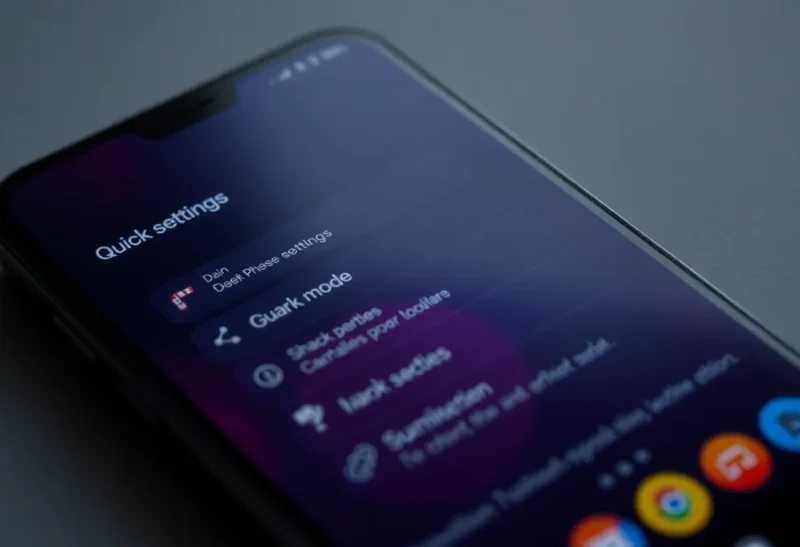
Most people use Android’s Quick Settings panel the same way every day: pull it down, tap Wi-Fi or Bluetooth, pull it back up. Maybe the flashlight if you’re fumbling around in a dark kitchen at 2am. That’s it. The rest of those tiles sit there, untouched, like furniture you bought but never moved into the room you actually use.
That’s a real shame, because the Quick Settings panel is one of the most underrated interfaces on Android. It’s been iterated on quietly for years, and on modern Android it’s become genuinely powerful—not just as a shortcut drawer, but as a configurable control surface you can shape around exactly how you use your phone. The problem is almost nobody does any shaping at all.
Let’s fix that.
What the Quick Settings Panel Actually Is
When you swipe down once on most Android phones, you get a condensed row of tiles—your most important shortcuts. Swipe down again (or with two fingers) and you get the full panel: a grid of tiles that can span multiple pages. At the bottom there’s usually a pencil or edit icon that almost everyone ignores.
That edit button is the gateway to the real power here. Tap it, and you can drag tiles in and out of your active panel from a long list of available shortcuts. The default set varies by manufacturer, but the full pool is almost always bigger than what’s shown—and on stock Android 14 and 15, the pool is substantial.
What you’re building when you edit it properly isn’t just a list of toggles. It’s a second home screen, one that lives a single swipe away from wherever you are in the phone.
The Tiles You’re Probably Not Using
Let’s talk about what most people are leaving on the table.
Data Saver. Not just for low-data plans. Data Saver restricts background data across all apps and forces them to only sync when you’re actively using them. Great for when you’re on a train, tethered to a weak signal, or just want your battery to stop being eaten by background refresh you didn’t ask for. Having it as a tile means you can toggle it quickly when you need it, instead of burying it in Settings > Network.
Battery Saver (separate from dark mode). Yes, most people know this exists—but do you have it in your first six tiles where you can flip it instantly? Probably not. Battery Saver on Android is more aggressive than most people expect: it caps performance, limits background activity, reduces screen refresh rate on supported devices, and can add a meaningful hour or two to the end of a heavy day. Having it a single swipe away instead of behind two Settings menus means you’ll actually use it when you need it.
Screen Record. Android has had native screen recording for several versions now and it’s genuinely good—no third-party app required. But it doesn’t live in the Quick Settings panel by default on many phones. Add it there, and suddenly you can capture anything in under three seconds: a bug, a misbehaving app, a quick how-to for someone you’re helping remotely. The tap flow is: swipe down, tap Screen Record, tap Start. Done.
One-Handed Mode. This one splits opinion, but on larger phones—and most phones are very large now—it’s legitimately useful. The One-Handed Mode tile gives you immediate access to a smaller, reachable portion of the screen without permanently changing anything. It’s especially useful when you’re typing an address while carrying something in your other hand.
Hotspot. Most people have this buried in Settings > Network > Hotspot, which means they rarely use it on the fly. Pull it into your Quick Settings and you can share your connection with a laptop or tablet in about two seconds. More importantly, you can see at a glance whether your hotspot is active—useful if you have a tendency to forget you left it on.
Accessibility Shortcuts. If you use any accessibility features—colour correction, magnification, font scaling, reading speed controls—there’s often a corresponding Quick Settings tile. Having these accessible from the panel makes a huge difference compared to digging through the accessibility menu every time conditions change (different lighting, different distance from the screen, etc.).
VPN toggle. If you use a VPN app that supports Quick Settings tiles (most of the good ones do), this belongs in your active panel. You should know at a glance whether your VPN is active—and being able to toggle it without opening the app saves time every time you switch networks.
How Manufacturer Skins Change Everything
Worth noting: the Quick Settings experience varies significantly depending on whether you’re running stock Android, Samsung One UI, Xiaomi MIUI/HyperOS, or something else.
Samsung’s One UI has some genuinely useful additions—a Bixby Routines quick tile, a Modes tile for switching between focus/productivity/sleeping presets, and tighter integration with DeX if you use that. One UI also lets you trigger Routines directly from the panel, which is a legitimately powerful feature that most Samsung owners never discover.
Xiaomi and Realme add floating window toggles, which let you pin apps in floating resizable windows. The Quick Settings panel tile for this makes it very quick to switch an app into floating mode mid-session—useful if you’re watching a video and need to reference a browser or chat window at the same time.
Pixel phones running stock Android are closest to what Google intends. On Pixel, the first row of expanded Quick Settings tiles is unusually prominent—they show labels by default and you can long-press a tile to jump directly into the full settings for that feature. That long-press shortcut is underused. Long-pressing the Wi-Fi tile takes you to the Wi-Fi settings page. Long-pressing Bluetooth takes you to paired devices. Long-pressing the screen brightness tile takes you to the full display settings. It’s faster than navigating there from the main Settings app.
The Order of Your Tiles Matters
It sounds obvious, but people spend almost no time thinking about tile order, and it makes a real difference.
Your first row—visible with a single short swipe—is prime real estate. Whatever tiles are there, you see them before fully expanding the panel. That row should contain only the things you toggle multiple times per day: Wi-Fi, Bluetooth, sound mode, maybe Do Not Disturb.
The second and third rows (visible after the full two-finger swipe) should contain your “several times per week” tiles: hotspot, Data Saver, Battery Saver, screen rotation lock, VPN. These are things you need fast access to but not constantly.
Everything beyond that—screen record, one-handed mode, accessibility shortcuts, NFC, cast—can live later in the panel. You’ll find them when you need them, and the important stuff stays where it should.
Third-Party Tiles and App Integration
Since Android 7.0, apps have been able to register their own Quick Settings tiles via a standard API. Not enough developers use it, but the ones that do often create genuinely useful shortcuts.
Tasker, for instance, lets you create custom Quick Settings tiles that trigger any automation you’ve set up—without needing to go into the app. You could have a “Commute Mode” tile that enables Bluetooth, starts a playlist, mutes notifications, and sets a morning timer all in one tap. You could have a “Recording Session” tile that silences all notifications, boosts media volume, and disables auto-brightness.
Other apps worth checking: Home Assistant has Quick Settings tile support for controlling smart home devices. Bitwarden can add a password-fill tile. MacroDroid, like Tasker, supports custom automation tiles. Termux can expose shell script shortcuts.
The practical upshot: if you use any app heavily, it’s worth checking whether it offers a Quick Settings tile. You might find one that saves you multiple taps every day.
What Android 14 and 15 Changed
Google has been iterating on Quick Settings more actively in recent releases than they get credit for.
Android 14 introduced the ability for tiles to show richer status information at a glance—not just a coloured icon, but a subtitle with context. Battery percentage, active network name, VPN connection status. It also improved the editing interface, making it easier to see which tiles you have active versus available.
Android 15 extended this further, adding better support for custom tile states and improving how long-press actions are communicated to users. Less visible to the average person, but it means app developers now have better tools for making their Quick Settings integrations feel native rather than bolted on.
None of this matters if you’re still running the factory default tile layout from two years ago. The platform is ready. The panel is waiting. It’s just sitting there, mostly ignored.
A Few Configurations Worth Trying
If you’re not sure where to start, here are three setups that work well for different types of users:
For commuters and heavy travellers: Put Hotspot, VPN, Battery Saver, and Data Saver in your first two rows. You’re constantly switching between Wi-Fi and mobile data, managing battery life, and needing to share connections with a laptop. These should all be one swipe away.
For people who work from home: Focus Mode (if your Android version has it), Do Not Disturb, Screen Rotation Lock, and your VPN tile should be prominent. Working at home means you’re constantly managing your attention environment. The panel should help with that rather than hiding the controls in Settings menus.
For technical users: Developer options, USB tethering, ADB over Wi-Fi (via a third-party tile), and screen recording deserve prime placement. If you’re regularly debugging apps, accessing your phone from a computer, or capturing interactions for documentation, these save real time when they’re immediately accessible.
The Bigger Point About Android Philosophy
Android has always been about configurability—sometimes to a fault, sometimes in ways that feel overwhelming. But the Quick Settings panel represents configurability at its best: it’s bounded (you have a finite number of slots), immediately visible (it’s a swipe away from everywhere), and genuinely functional rather than decorative.
The fact that most people never customise it isn’t a reflection of its usefulness. It’s a reflection of how few people engage with their phone as a tool to be configured rather than a product to be consumed as-delivered. The default layout is fine. A custom layout built around how you actually use your phone every day is better.
It takes maybe five minutes to set up. The edit interface is straightforward, drag-and-drop, no root required. And once it’s done, you’ll stop opening the Settings app as often, stop hunting through menus, and stop missing features you wanted to use but couldn’t find quickly enough to bother.
Five minutes. One swipe. A lot less friction. That’s the whole pitch.