The Hidden UX Decisions Inside Every Mobile Payment System

Morgan Reese
July 7, 2026
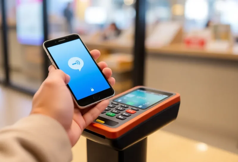
Tapping your phone to pay takes under two seconds. Behind those two seconds is a set of design decisions involving security, psychology, regulatory compliance, fraud prevention, and the competing interests of card networks, banks, device manufacturers, and merchants. The elegance of the interaction conceals the complexity of the system that produces it, and the specific choices made at each layer have consequences that affect how often payments succeed, how secure they are, and how much users trust the system enough to use it.
Here’s what’s actually happening inside a mobile payment transaction—and the UX decisions that made it this way.
The Authentication Layer: Why Biometrics Changed Everything
Before face ID and fingerprint readers, mobile payments faced a fundamental authentication problem. A PIN entered every time was friction that would reduce adoption; no authentication was a security liability that card networks wouldn’t accept; and passwords on a phone screen were impractical. The biometric authentication enabled by Touch ID (2013) and Face ID (2017) was not just a convenience upgrade—it was the unlock that made tap-to-pay UX viable.
The UX decision embedded in biometric authentication is the relationship between friction and security. Every additional step in a payment flow reduces completion rates by a measurable percentage. Apple Pay’s design principle—a single biometric confirmation, then a tap—was validated by the payment conversion rates it produced compared to alternatives. Google Pay’s equivalent, Samsung Pay’s MST+NFC approach, and the various regional wallets that followed all made the same core decision: biometric authentication as the single gate, with the device holding the payment credential securely.
The security architecture behind this is significant: Apple Pay uses a Secure Enclave—a dedicated security processor physically separate from the main CPU—to store the cryptographic keys that represent your payment credentials. Your actual card number is never transmitted during a payment; a device-specific virtual account number (a token) is used instead, with a one-time transaction code for each payment. This tokenisation means a merchant data breach that captures tap-to-pay transaction data captures nothing useful for creating fraudulent charges—the one-time codes are specific to each transaction.
The UX decision to hide this complexity—to present a single biometric confirmation rather than explaining tokens and secure enclaves—is deliberate. Research on payment anxiety (the hesitation users feel when uncertain whether a transaction has succeeded or is secure) shows that visible security indicators paradoxically increase anxiety rather than reducing it. The minimalist “approved” feedback rather than a security certificate display is a deliberate design choice.

The Confirmation Step: How Long Should Feedback Last?
After a payment is approved, the device shows a success indicator—a checkmark, the word “Done,” often a haptic pulse. How long this indicator displays, what it shows, and how the phone behaves immediately afterward are consequential UX decisions that payments teams have spent significant effort on.
Display too briefly and users doubt whether the payment went through—leading to double taps that create duplicate charges or confused merchants. Display too long and users feel held hostage to a completed transaction while others wait in line. The optimal window is typically 2–4 seconds, long enough for confident recognition without creating social awkwardness at point of sale.
The feedback modalities matter too. Haptic feedback (a specific tap pattern on successful payment) was introduced partly because visual-only feedback failed users in bright outdoor environments or when the phone was angled away from their eyeline. The distinctive Apple Pay haptic on successful payment became part of the “tap to pay works” confirmation loop that users learn to expect. Removing or changing it meaningfully affects user confidence.
Bank-issued debit and credit apps that added “tap to pay” features without the integrated hardware-level haptic often produce worse UX—the payment succeeds but the confirmation feels less definitive because it’s missing the physical signal that has become associated with transaction success. This is a hardware-software integration decision that smaller payment apps can’t replicate regardless of software quality.
The Transaction Limit Problem: Why Tap to Pay Sometimes Asks for a PIN
In many markets, contactless payments above a certain amount (typically €50 in the EU, £100 in the UK, varying in other markets) require a PIN or biometric confirmation—even for tap-to-pay transactions that would otherwise require only holding the phone near the terminal. These limits are set by card network rules (Visa and Mastercard establish the frameworks) and local regulatory requirements.
The UX consequence is a payment flow that sometimes works with a single tap and sometimes adds an authentication step, with the threshold invisible to the user. Users who don’t understand the limit system experience this as random failure—sometimes it works, sometimes it asks for something extra—which reduces trust in the system even when it’s working correctly.
This is a case where the UX is constrained by regulatory and security requirements that prioritise fraud loss containment over user experience consistency. The compromise payment designers have landed on: make the additional authentication step as fast and painless as possible (biometric rather than PIN where possible), and provide clear feedback about why the extra step was required (“Transaction above contactless limit, please authenticate”).
The “cumulative contactless limit”—where some terminal configurations require a PIN after a certain number of sequential tap payments regardless of individual transaction amount—is an even more confusing version of this problem. A user who has made five small contactless purchases and is suddenly asked for a PIN on the sixth has no intuitive explanation for the requirement. This is a security control (preventing stolen cards from being used for unlimited small transactions) presented to users with no contextual explanation, which UX teams have addressed with varying levels of success.
The Loading State Design: Managing Uncertainty
A payment that takes longer than expected is anxiety-inducing in a way that has no close parallel in other digital interactions. A slow web page loading is mildly frustrating; a slow payment confirmation creates genuine uncertainty about money—did it go through? Should I try again? Did I get charged twice?
Payment app loading states are designed with specific timing thresholds and messaging strategies to manage this anxiety. A spinner with no message creates maximum uncertainty. A message that appears after 2–3 seconds (“Connecting to your bank…”) acknowledges the delay and frames it as a known process rather than a failure. A message after 5–8 seconds (“This is taking longer than usual—please don’t tap again”) actively prevents the double-charge problem.
Timeout handling—what happens when a payment can’t be confirmed within a threshold—requires specific design: an ambiguous result (payment may or may not have gone through) is the worst possible outcome and must be avoided. The system must route to a definitive state: either confirmed success, confirmed failure, or a clear instruction to contact the bank. The interaction design for timeout states is often more complex than the happy-path design and receives less attention—which is why payment error handling is frequently the weakest part of mobile payment UX.

Card Addition Flow: The Onboarding Dropout Problem
The highest-friction point in mobile payment systems is card addition—the process of enrolling a payment card in the digital wallet. This is where most users who will never use mobile payments make their exit.
Card addition requires: entering card details (number, expiry, CVV), accepting terms, and completing bank verification (typically via a one-time code sent by SMS or in-app push from the banking app). Each step loses a fraction of users. The verification step—which requires switching to a banking app, receiving a code, and returning—loses a significant fraction because it requires navigation that many users won’t complete, particularly on first attempt.
Apple’s camera-based card scan (point camera at physical card, details auto-populated) reduces the data entry friction substantially. Banks that offer in-app card provisioning (tap to add to Apple Pay directly from the banking app without re-entering card details) reduce the switching friction. These optimisations matter enormously: the difference between 40% and 70% card enrollment completion rates for users who initiate the process has been documented in financial institution analytics.
The verification step design is constrained by card network requirements: Visa and Mastercard mandate that the cardholder be verified as the actual card owner before provisioning to a digital wallet, which is why SMS OTPs and banking app push confirmations exist. The UX is the minimum friction achievable within that mandatory verification framework, not the minimum friction possible without security constraints.
Merchant Category and Receipt UX
After a payment, the transaction appears in the user’s payment history. What appears there—the merchant name, category icon, amount, location—is a set of UX decisions with downstream consequences for expense tracking and dispute resolution.
Merchant names in bank and payment app histories are processed from the raw descriptor string that merchants submit during the transaction—a field that is often a truncated legal entity name rather than a recognisable brand name. “TGT*TARGET.COM” is Target’s payment descriptor in some systems; “AMZN MKTP US” is Amazon. Payment apps like Apple Card, Monzo, and Revolut have invested significantly in merchant name cleaning and categorisation—mapping raw descriptors to recognisable merchant names and category icons—because users who don’t recognise their own transactions raise fraud alerts and contact support at rates that are expensive to handle.
This merchant enrichment is a significant data infrastructure investment largely invisible to users who experience it as “my transaction says Target, not TGT*TARGET.COM.” Banks and legacy payment apps that haven’t made this investment produce transaction histories that feel illegible by comparison—not because the underlying payment system is different, but because the post-transaction display layer hasn’t been designed.
Why Region Determines Which Features Exist
Mobile payment UX varies significantly by region not because of different design philosophies but because of different underlying payment infrastructure, regulatory requirements, and card network dominance.
In markets with high Alipay and WeChat Pay penetration (China, parts of Southeast Asia), QR code-based payments dominate over NFC tap-to-pay—partly historical (NFC-equipped terminals were slower to deploy) and partly deliberate (Alipay and WeChat Pay’s QR approach works on any smartphone, including non-NFC hardware). The QR-based UX (open app, display or scan a code, wait for confirmation) is different from NFC UX in ways that shape user expectations.
In India, UPI (Unified Payments Interface) enables instant bank-to-bank transfers with a VPA (Virtual Payment Address) model that bypasses card networks entirely. The UX is different again: you pay to a person or merchant identifier, not a card terminal. PhonePe, Google Pay, and Paytm in India are all UPI apps with different UX implementations of the same underlying payment rails.
These regional variations mean that “mobile payment UX” is not a single thing: it’s a family of related interaction patterns built on different infrastructure, optimised for different context, and shaped by different regulatory environments. The design decisions made by Apple Pay in the US reflect specific card network requirements, hardware capabilities, and user expectations that don’t directly translate to what the optimal mobile payment UX looks like in every market.
The two-second tap that authorises your purchase represents one particular resolution of these competing constraints—elegant precisely because the engineering and design decisions required to achieve that elegance are hidden so completely that the technology feels like it disappears.