reMarkable Paper Pro vs Supernote Nomad: Handwriting Latency and Feel in 2026

James Webb
April 8, 2026

Handwriting on glass never fooled anyone. Handwriting on matte e-ink gets closer—close enough that people argue online about milliseconds and nib feel as if they were tasting wine. In 2026, the reMarkable Paper Pro and Supernote Nomad are two flagship answers to the same question: can digital ink feel like a tool you reach for without thinking, not a compromise you tolerate?
This comparison focuses on what actually changes daily use: latency, friction, software philosophy, and the trade-offs each vendor accepts. It is not a spec horse race; it is a feel and workflow guide. Names and SKUs evolve; the questions you should ask in a store remain stubbornly constant.
Latency: numbers versus perception
Manufacturers quote response times that rarely match your lived experience—brush settings, pen speed, ambient temperature, and refresh strategy all matter. What matters in practice is whether ink appears under the nib fast enough that your brain stops predicting. Both devices aim for that threshold; they reach it differently depending on pen mode, canvas zoom, and whether the system prioritizes clarity or speed in a given moment.
If you write fast—dense math, rapid shorthand—test in a store or borrow a unit. Slow writers notice polish; fast writers notice coherence. Latency is not one number; it is a distribution across your own habits.
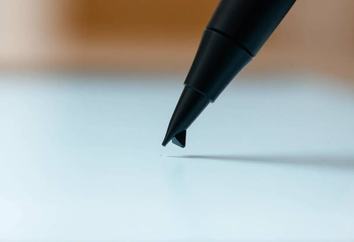
Texture, friction, and sound
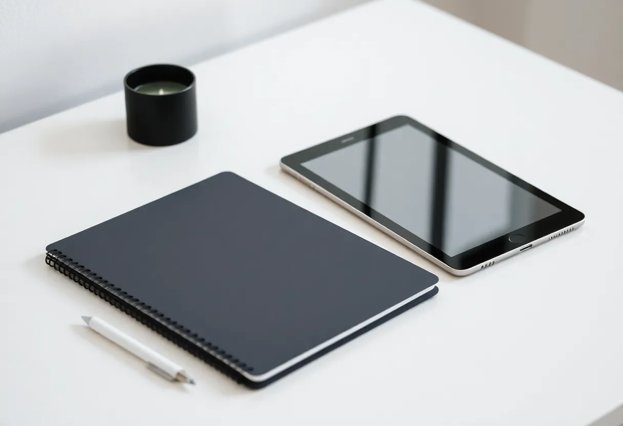
Feel is more than milliseconds. It is the scratch of nib on surface, the resistance that steadies curves, and the sound that tells your brain “this is paper-ish.” reMarkable built its brand on paper-like drag; Supernote built its brand on a harder glass-like surface that some users love and others find slick. Nomad continues Supernote’s emphasis on durability and a particular glide profile, while Paper Pro pushes larger canvas and color considerations that change how texture reads under different lighting.
Also consider grip fatigue: wider devices change wrist angles. A few millimeters of thickness and a hundred grams of weight matter across a ninety-minute session. Nomad’s smaller footprint can feel easier in transit but cramped for split-screen PDFs; Paper Pro’s larger frame can feel luxurious until you stand on a crowded train.
Calibration: pressure curves and “ink” personality
Latency is only half of “does this feel like my pen?” Pressure response, tilt behavior, and line taper determine whether your sketches look alive or flattened. Some users prefer a softer ramp—notes feel gentle; others want aggressive contrast for crisp printing-like lines. Firmware updates occasionally tweak these curves, which is great for improvement and annoying for muscle memory. Expect to spend a week re-tuning templates after major updates.
Templates and professional use cases
Lawyers, physicians, and engineers often need repeatable layouts—lined, graphed, Cornell-style, or custom margins. Both ecosystems support templates, but your patience for setup differs. If you live inside a narrow template set, optimize once and forget. If you constantly switch contexts, favor the OS that makes template switching frictionless.
Software culture: distraction-free versus structured
reMarkable’s OS still leans minimal—notebooks, folders, PDF markup, and a deliberate resistance to becoming a full tablet. Supernote historically embraced deeper PDF workflows, handwriting search, and plugins—power-user amenities that can add complexity. Your “best” device is the one whose software matches your tolerance for knobs.
Ask a blunt question: do you want your tablet to resist becoming a distraction, or do you want it to become a workstation? There is no universal virtue—only fit. Students drowning in tabs sometimes crave minimalism; researchers drowning in PDFs sometimes crave depth. Pick the philosophy that matches your failure mode.
Third-party tools and workarounds
Both communities invent workflows—browser extensions, export pipelines, Obsidian bridges, email-to-device tricks. Those can extend capability and also create fragility when vendors change APIs. If you rely on a hack, budget time to maintain it. The least stressful setups are boring: periodic exports into a folder you control.
Color on Paper Pro: who benefits
Color e-ink changes review workflows—highlights, mild color coding, and reading materials where hue carries meaning. It also changes expectations: color panels can shift contrast trade-offs versus monochrome. If you are pure black-ink notes, color is optional; if you markup textbooks or diagrams, color can reduce cognitive translation.
Be honest about how you use color. If you only need occasional highlights, ask whether a monochrome workflow plus disciplined tags might serve you equally well. Color is delightful when it earns its place; it is expensive when it becomes decoration.
Reading versus writing balance
Some buyers want an e-reader that can note; others want a notebook that can read. Paper Pro’s larger color canvas tilts toward mixed consumption and markup. Nomad tilts toward portability-first writing with reading as a strong secondary. Neither is exclusive, but your primary verb matters. Buy for the job you do five days a week, not the job you imagine doing after you buy the device.
Battery and weight: carry reality
Larger canvases and color stacks influence weight and battery planning. Nomad’s portability pitch is literal for bags and pockets; Paper Pro’s pitch is screen real estate for split views and PDF scale. Neither is “better”—they optimize different bags and desks.
Real-world battery life depends on frontlight usage, Wi-Fi sync cadence, and whether you leave sleep modes aggressive. If you are a heavy sync user, expect more charging days; if you are offline-first, expect peace. The marketing page rarely matches your exact toggles.
Repairability and longevity
E-ink devices are not phones; repair networks vary by region. Consider cases, screen protectors compatible with your pen, and whether you can tolerate shipping delays if something cracks. Durability stories matter for students and field workers more than for desk-only users.
Ecosystem lock-in and exports
Both vendors let you export, but your long-term archive strategy depends on formats, cloud sync comfort, and whether you want local-first workflows. If you need bulletproof archival, plan exports as habit—not as a someday migration.
Pen tips, wear, and ongoing costs
Digital pens are not free to own forever. Felt tips wear, harder nibs scratch differently, and third-party styluses vary in offset and jitter. Budget not only the device but the replacement rhythm you can tolerate. If you write daily, a small annual pen budget matters as much as the tablet price spread.
Lighting: frontlight quality beats lumen marketing
Evening readers should care about uniformity and warm tones, not peak brightness alone. Color panels can show subtle gradients differently than monochrome; some users are sensitive to uneven frontlight at low levels. If you read in bed, test dim settings with your actual font sizes and zoom levels—not the retail demo screen.
PDF workflows: scale, crop, and patience
Large PDFs punish every e-ink platform. Paper size, margin crop, and reflow strategies matter more than raw CPU claims. If your job is annotating court filings, textbooks, or sheet music, bring a sample file and scroll aggressively. Lag often shows up in navigation, not in a single static page.
Handwriting recognition and search
If you need to find notes later, test search quality on your own handwriting—messy bullets, mixed print and cursive, and quick margins. Recognition keeps improving, but your personal script remains the ultimate test. Supernote’s historical strength in search and plugins matters here; reMarkable’s simpler stack may feel cleaner if you do not need advanced retrieval.
Collaboration and sharing
Neither device is a Google Docs replacement. If you share notes with classmates or colleagues, exports and email remain common paths. Decide whether you need live collaboration or only periodic snapshots. Misaligned expectations create more “device regret” than latency ever.
2026 market context
E-ink competition is stronger than ever—color panels improve, monochrome keeps refining, and iPads still tempt with speed. The honest pitch for these devices is focus and eye comfort, not raw performance. If you are chasing app multitasking, you are shopping the wrong category. If you are chasing a calmer thinking surface, you are in the right one.
Who should lean Paper Pro
- Readers who want large canvas and color markup for mixed documents.
- Users who prefer reMarkable’s minimal OS and distraction-free philosophy.
- People who want a strong first-party pen experience with a polished retail story.
Who should lean Nomad
- Travelers who prioritize compact footprint and durability.
- Users who want Supernote’s PDF and plugin ecosystem.
- Writers who prefer Supernote’s glide and are willing to adapt to its culture.
Takeaways
Latency and feel are real, but personal. Paper Pro rewards big-canvas and color workflows; Nomad rewards portability and Supernote’s power-user features. Try before you mythologize—your hand speed is the final benchmark.
If you fear choosing wrong, pick the ecosystem whose software values match yours. Hardware ages; habits linger. The tablet you actually open after a tiring day is the one that wins—regardless of forum debates about milliseconds.
Give yourself a two-week trial mindset: carry it daily, charge it normally, and notice whether you reach for paper less because the digital flow earned trust—or because you feel obligated to justify the purchase. Obligation fades; trust compounds. The best note system is the one you forgive on bad days and still reach for the next morning without dread or pointless any tiny post-purchase guilt.