Kobo Libra Colour vs Monochrome: Who Actually Needs Color E-Ink in 2026

Mira Sandoval
April 8, 2026

Color e-ink stopped being a trade-show curiosity around the time readers started asking a sharper question: is the color worth what you give up? Kobo’s Libra line now splits into a color model and a monochrome sibling that still wins on contrast and battery subtlety. If you are deciding between a Libra Colour and a monochrome Libra—often the Libra 2 in conversations, depending on region and stock—the decision is not “new versus old.” It is what you read versus how you read.
This piece compares the two paths without pretending specs tell the whole story. We will talk cover art, comics, PDFs, annotation, battery life expectations, and the honest cases where monochrome remains king. Where regional naming differs, think “Libra with color” versus “Libra tuned for text”—the buying logic holds even if the exact SKU on the shelf varies.
What color e-ink is good at now
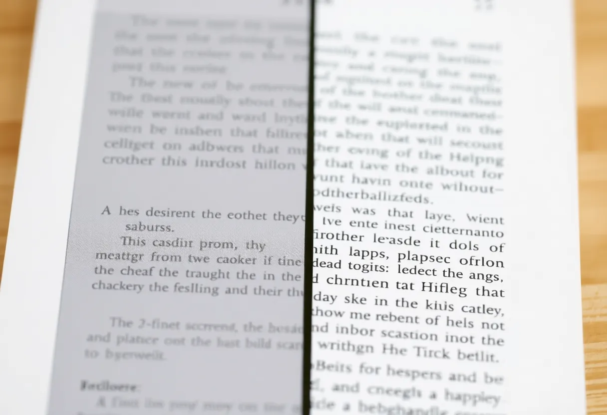
Modern Kaleido-class panels can render covers, panels, and diagrams in color that is finally pleasant—not LCD-vivid, but recognizable. For manga, cookbooks with photography, and technical PDFs where a red callout actually matters, color removes friction. You spend less mental energy translating grayscale shading into “which wire was supposed to be live again?”
Library browsing also changes. Discoverability is a visual medium. When cover thumbnails look like covers—not muddy abstractions—you pick up books you might have scrolled past on a monochrome home screen.
What monochrome still wins
Text-first readers live for crisp type and high contrast. Monochrome Carta-class panels still lead for fine fonts, especially at smaller sizes. If your diet is mostly EPUB novels, long-form journalism, and night reading with warm frontlight, you are not missing much without color. You are gaining speed, clarity, and often a bit more battery headroom because the panel is not juggling multi-layer color tricks.
Monochrome also ages gracefully. Color panels improve every generation, but the “best black” is still a moving target. Monochrome has fewer moving parts.
Who should lean Libra Colour
- Comics and graphic novels. If you read them weekly, color is not cosmetic—it is narrative.
- Illustrated nonfiction. History, design, nature guides: color carries meaning, not decoration.
- PDFs with charts and highlights. Academic slides, reports, manuals—color often encodes categories.
- Magazine-style layouts. If you subscribe to periodicals where photography matters, color reduces cognitive load.
Who should stay monochrome
- Pure text readers. If you finish fifty novels a year and rarely open images, you are paying for pigment you will not use.
- Annotation-heavy academic workflows. Not because color cannot annotate—because monochrome clarity at small sizes still matters for dense footnotes.
- Minimalists chasing the longest calm sessions. Fewer visual modes can mean less fiddling with settings.
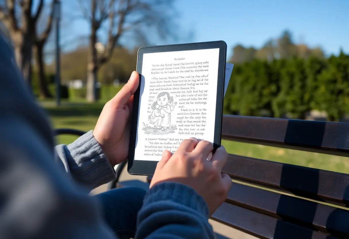
Comfort, lighting, and the “paper” illusion
Both Libra models share ergonomics and frontlight tricks. The difference is where your eyes land. Color invites brighter scenes; monochrome invites deeper blacks. If you read mostly in dim rooms, monochrome’s contrast can feel gentler at low brightness. If you read outdoors with mixed content, color’s separation of hues can reduce squinting when the sun washes out subtle gradients.
Frontlight uniformity matters more than marketing lux numbers. Slight shadows at the bottom edge can annoy text readers who lock onto a baseline grid; color readers sometimes notice tint shifts across the panel when large illustrations fill the screen. Neither problem is universal, but it is why in-store demos help—hold the device, tilt it, and read a full page of small type, not just a hero image.
Latency, ghosting, and refresh modes
E-ink refreshes are a compromise between speed and cleanliness. Color layers add constraints: you may see more ghosting in fast page turns if you refuse full refreshes, or slightly slower transitions if you demand pristine panels. Monochrome can feel snappier in pure-text mode because the controller optimizes for one job.
If you are sensitive to micro-stutters, try the same book on both devices with your preferred font size. The difference is smaller than it used to be, but text purists still notice. If you mostly flip images—comics, magazines—you may care less about sub-typographic crispness and more about color separation between panels.
Weight, battery, and travel habits
Libra-class devices are already light, but travel habits change priorities. A reader who commutes with two hours of daily reading may notice battery differences more than someone who reads thirty minutes at night. Color can nudge power use depending on content mix—bright pages, frequent cover browsing, image-heavy PDFs. Monochrome rewards linear text sessions with predictable drain.
Carry cases matter too: a folio that wakes the device on open can mask small battery differences by reducing idle mistakes. If you toss a reader loose in a bag, accidental wakes punish either model, but color screens sometimes tempt more “quick peek” sessions at home-screen thumbnails.
Store and format realities
Kobo’s ecosystem does not care which Libra you buy—you still get OverDrive, Pocket, and sideloaded EPUBs. The color decision is about rendering, not access. If your library is EPUB-first, either device is fine. If your library is PDF-first, test a few heavy files on both if you can; PDFs punish slow screens regardless of color.
Sideloading also means you can optimize files. EPUBs with large embedded images behave differently than lean text. If you are converting from other formats, run a few through a cleanup pass—oversized images stress any panel, but color makes the cost visible in ways monochrome hid.
Accessibility angles
Some readers rely on high contrast modes, larger fonts, or specific font combinations. Monochrome often pairs with aggressive contrast boosts for pure text. Color can help when color cues carry meaning—think diagrams in textbooks—if the palette is readable. If you are choosing for someone with low vision, bring real content samples, not demo pages.
Price and longevity math
Color often costs more upfront. Spread that over three to five years of reading and the difference can be trivial—or decisive if you were on a tight budget. Also consider resale: hot new color panels sometimes hold attention, but monochrome workhorses remain easy sells to text purists.
Warranty and accidental damage policies matter more than people admit. E-readers travel. If you are hard on gear, factor a case and maybe a protection plan into the total cost before you let color tempt you. A cracked screen hurts either way; a device you treat carefully rewards you with longer refresh cycles and fewer “should I upgrade?” moments driven by scratches rather than needs.
Software features that do not care about the panel
Dictionary lookup, annotations, reading stats, and sync are largely identical within the Libra family. Where you might feel differences is in image-heavy notes—if you sketch or mark up screenshots, color can matter for later review. If you only highlight sentences, monochrome stays invisible to your workflow.
Also consider Pocket and article mode: many saved web articles include hero images and inline photography. Color makes those articles feel closer to their web originals. Monochrome still reads fine, but you will mentally translate photos into grayscale summaries. That translation is either neutral or annoying depending on your brain.
Household dynamics
Shared devices complicate the choice. A family that mixes picture books, student PDFs, and adult novels may benefit more from color—even if one member would have preferred monochrome. Conversely, a single heavy reader with strong opinions about typography should not let household averages override personal comfort. Sometimes the right answer is two devices with different strengths, not one compromise that satisfies nobody.
2026 honesty check
We are past the era where color e-ink was a joke. We are not yet past the era where monochrome is the best text experience. If you want one device for novels and comics, Libra Colour is easy to justify. If you want the cleanest possible letters and the least visual compromise for long reading sessions, monochrome still earns its keep.
Competition in e-readers is healthier than ever, which is good for buyers and confusing for headlines. The Libra fork is not about “winner and loser.” It is about branching use cases. The person who reads web articles saved to Pocket all day has different needs from the person who reads weekly manga volumes and occasional EPUBs.
Decision shortcut
If you must choose in one minute: ask what percentage of your annual reading is visual. If the answer is north of thirty percent, lean color. If it is under ten percent, lean monochrome. If you sit in the middle, buy the device that matches your guiltiest pleasure—because that is what you will actually open after a long day.
Takeaways
Pick Libra Colour when color carries information you actually use—comics, illustrated books, charts, and covers that help you choose. Pick monochrome when you are chasing text contrast, simplicity, and battery peace. The “right” Libra is the one that matches your library, not the newest acronym on the spec sheet.
If you finish this article still unsure, borrow a rule from photography: buy the tool that flatters what you shoot most. Readers shoot pages. Let your page mix—not forum debates—pick the panel. When in doubt, choose the device that makes your favorite format feel effortless.