E-Ink Outdoor Readability: What 2026 Spec Sheets Still Won’t Tell You

Priya Sharma
April 7, 2026

Shopping for an e-ink tablet or large-format reader in 2026, you will see the same comforting phrases recycled on product pages: paper-like, glare-free, readable in direct sunlight. Those claims are directionally true—e-paper really does beat emissive displays outdoors—but they are not a substitute for understanding what actually happens when you step off the porch and into real light.
This piece is about outdoor readability specifically: not resolution wars, not note-taking latency, but the physics and marketing gap between lab-friendly bullet points and a bright afternoon on concrete. If you are choosing hardware for field work, travel, or just reading on a sunny stoop, here is what spec sheets still gloss over—and how to evaluate devices without trusting adjectives.
Why e-ink wins outside (and what “winning” means)
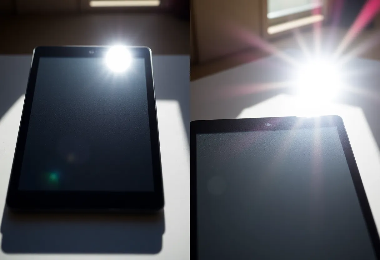
Traditional LCD and OLED panels fight the sun by blasting more light through glass. Outdoors, that often turns into mirror-like reflections and washed-out contrast. E-ink and similar reflective displays work more like paper: ambient light bounces off the surface and carries the image to your eyes. In strong, diffuse daylight, a good e-ink panel can look almost serene next to a phone at max brightness.
That is the honest core of the marketing. The missing nuance is that reflective displays still have front optics: cover glass, touch layers, anti-glare coatings, and (on some devices) front lights that change how light scatters. Two devices with the same “300 PPI” headline can behave differently outside because the stack above the ink layer is not identical—and almost nobody publishes comparable outdoor contrast curves in consumer listings.
The spec sheet staples: PPI, grayscale, and color e-ink
Pixels per inch still matters outdoors, but not the way it matters on a phone. At arm’s length, you care about whether type stays crisp in harsh light, not whether you can spot a single-pixel defect. More PPI helps small footnotes and dense PDFs; it does not magically defeat glare from a fingerprint-smudged front glass.
Grayscale depth influences how smooth gradients look in comics, maps, and photographs. Outdoors, aggressive compression of tones can make images look posterized when the ambient light is unforgiving. Specs rarely tell you how a device dithers mid-tones under sunlight; reviews that include outdoor photo samples are worth more than a “16 gray levels” callout.
Color e-ink in 2026 keeps improving, but color panels often trade contrast and refresh behavior for hue. Outside, color can look pleasantly muted—or disappointingly dim—depending on panel generation and front-light design. If your primary use is outdoor reference PDFs with highlights and diagrams, try to see color units in person; marketing renders are almost always optimistic.
Front lights: helpful indoors, tricky in mixed light
Warm and cool front lights are genuinely useful for evening reading. In mixed outdoor conditions—dappled tree shade, awnings, car windows—they introduce a new variable: you are now balancing reflected ambient light with emitted light from the edge LEDs. Some devices handle this gracefully; others produce uneven pools of brightness or a faint “frame” near the bezel.
Spec sheets advertise color temperature sliders and brightness steps, not uniformity. Yet uniformity is what determines whether a page feels flat when half the screen is in shadow. If you read in cafes, stadiums, or under pergolas, pay attention to user photos with the front light on in partial shade, not just studio shots.

Refresh modes and the outdoor distraction tax
Fast refresh modes on modern e-ink tablets reduce ghosting when scrolling. Outdoors, aggressive partial refreshes can create subtle shimmer—especially if you are moving while reading on a train platform or walking slowly with the device angled. This is not always a defect; it is a trade-off between speed and visual stability.
Manufacturers rarely list “shimmer under sunlight” because it is situational. Practical takeaway: if you plan to use a device while in motion, prioritize models reviewers call stable in normal reading mode, not just the fastest sketch mode. Artists may want snappy refresh; long-form readers may prefer calmer updates that do not pull attention from the sentence.
Screen size and aspect: what “large” changes outside
Smaller six- to seven-inch readers are easy to shade with a hand or a hat brim. Ten- to thirteen-inch tablets expose more glass to the sky, which can mean more opportunities for specular reflections even when the underlying panel is excellent. Manufacturers sometimes add textured glass or slightly recessed bezels to help; those choices rarely appear as line items beside resolution.
If you annotate PDFs outdoors, larger screens help ergonomically—you zoom less—but they also catch more ambient glare simply because the viewing area is bigger. A folding cover that doubles as a sun shade is not a gimmick for everyone; for some workflows it is the difference between comfortable reference reading and squinting at footnotes.
Who actually needs outdoor-first e-ink?
Field technicians and inspectors often juggle checklists, diagrams, and photos in variable light. For them, outdoor readability is not a lifestyle flex; it is a fatigue issue. A display that does not force constant repositioning saves time and reduces mistakes.
Students and researchers may read between classes, on buses, or on campus lawns. Here, weight and one-handed balance matter as much as contrast. Spec sheets publish grams; they do not publish “how stable the device feels when you are standing.”
Travelers face airport atriums, train windows, and pool decks—each a different glare geometry. If you buy primarily for airplanes (dim cabin) but occasionally read on a bright balcony, test for the balcony case. Cabin performance is the easy story; vacation sun is where marketing oversells.
Environmental realities: temperature, dust, and hands
Battery chemistry and display responsiveness can shift with temperature. Cold mornings can slow e-ink updates; hot afternoons can make you care more about grip and sweat than contrast. Spec sheets list operating temperatures, but they do not tell you how the device feels when you are wearing gloves or when sunscreen smears the glass.
Matte screen protectors change outdoor behavior. They can reduce specular highlights and add a pleasing toothy texture—or scatter light in a way that softens small text. If outdoor reading is your main goal, treat protectors as part of the optical stack, not an afterthought.
How to test a device without a light booth
You do not need a laboratory to cut through marketing. Bring a phone with a bright OLED and your current e-reader, if you have one, and try the same PDF on both:
- Full sun on pale concrete. Check whether body text stays comfortable for three uninterrupted minutes—not a glance.
- High-contrast map or schematic. Thin colored lines reveal weaknesses color e-ink still has.
- Angled viewing. Tilt the device like you would on a plane tray table; watch for color shift and glare hotspots.
- Front light at 40% in shade. Look for banding or uneven corners.
If you cannot visit a store, seek reviewers who shoot unpolished outdoor footage. Over-edited hero images are the spec sheet’s cousin.
Coatings, oleophobic layers, and the “clean screen” advantage
Outdoor contrast is not only about the ink film. Oleophobic coatings influence how aggressively fingerprints show up; in sunlight, smudges become miniature lenses. Some vendors prioritize a silky feel; others prioritize matte diffusion that hides oil but softens text slightly. You will not see “smudge visibility index” on a product page, yet it dominates real-world satisfaction after a week of commuting.
Similarly, anti-reflective treatments differ between plastic film fronts and glass fronts. Film can feel lighter and shatter-friendlier; glass can look more premium and wipe cleaner. Neither choice is universally better for sun—only different. If you are comparing two SKUs, look past the word “anti-glare” to user photos taken after a day of casual handling, not straight out of the box.
Software matters: bold type, margins, and PDF engines
Two devices with identical panels can feel worlds apart outdoors depending on rendering. Reader apps that support true bolding, customizable line spacing, and high-contrast modes make better use of limited tonal range than apps that rely on faint gray body text. Spec sheets never mention your reading app, but it is part of the optical stack.
For academic PDFs, cropping margins and reflowing where possible beats pinching and zooming in glare. If your workflow is locked to a vendor store, check whether sideloaded documents get the same rendering path—some devices treat personal files as second-class citizens, which shows up fastest when the sun is unforgiving.
What to demand from the industry next
Consumers would benefit from standardized disclosures: reflective contrast under a defined illuminance, front-light uniformity maps, and typical full-refresh times at room temperature versus cold. Until then, treat outdoor claims as invitations to test, not guarantees.
Bottom line
E-ink remains the most pleasant reflective reading technology most people can buy in 2026—but outdoor readability is a bundle of glass, coatings, panel generation, lighting, and software refresh policies. Spec sheets sell the category’s strengths while hiding the variance between models. Your best defense is a skeptical eye, a sunny afternoon, and a PDF that looks boring—because boring text in harsh light tells the truth faster than any slogan.