Color E-Ink Displays in 2026: Where They’re Great—and Where They’re Still a Compromise

Priya Sharma
April 6, 2026

For years, e-ink meant grayscale serenity: novels on the porch, PDFs without eye strain, and battery life measured in weeks. Color e-ink promised a bridge between that calm and the rainbow world of apps, comics, and highlighted notes. In 2026, the hardware is finally interesting enough to take seriously—but “interesting” is not the same as “ready to replace your iPad for everything.” The honest story is a patchwork of genuine wins, stubborn physics, and use cases that finally line up if you stop expecting the wrong miracles.
This piece walks through where color e-ink shines today, where it still trips over refresh rates and color fidelity, and how to decide whether your next device should be paper-like or glass-glossy.
It also avoids the trap of treating “color e-ink” as one uniform technology. Vendors mix different panel generations, controller firmware, and front-light systems; two devices with similar marketing language can feel worlds apart in daily use. Think in terms of workflows and environments first, then narrow to models that reviewers actually torture-tested the way you plan to.
What changed: color without pretending it is OLED
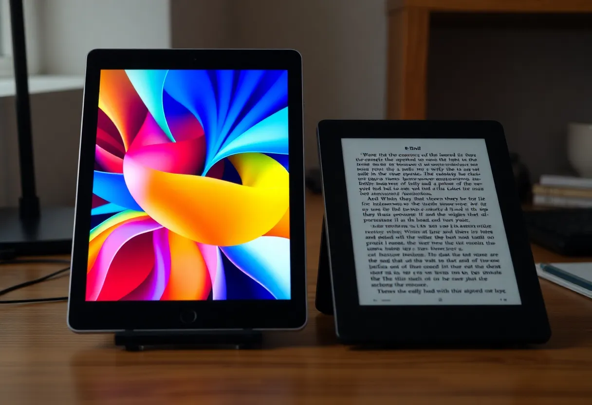
Early color e-ink implementations often felt like a novelty layer on top of grayscale: limited palette, muddy contrast, and ghosting that made UI animations look like a memory of a memory. Recent generations push more usable saturation and faster partial refresh modes—enough that comics, textbooks with diagrams, and color-coded notes can be pleasant rather than punishing.
The key mindset shift is expectations. Color e-ink is still fighting the same fundamental battle: moving charged particles inside a fluid takes time. Manufacturers can hide that with clever driving waveforms and local refresh tricks, but they cannot repeal the difference between emissive pixels that flash at 120 Hz and reflective panels that optimize for readability.
That is why the best color e-ink experiences in 2026 often come from vendors who invest in software as much as glass. A slightly slower panel with smarter dithering and less aggressive sharpening can look more natural than a “faster” panel driven badly. When you read hands-on reviews, pay attention to firmware maturity and update cadence—not only the generation name printed on the box.

Where color e-ink is genuinely great in 2026
Outdoor and bright-room reading. If your primary pain point is sunlight and glare, reflective displays remain unmatched for comfort. Color adds context—maps, charts, magazine layouts—without forcing you back to a glossy slab that doubles as a mirror.
Long sessions with static content. Textbooks, research papers, manga, and annotated PDFs spend most of their time still on screen. E-ink’s advantage is not just battery; it is the reduced visual noise when you are not constantly refreshing motion.
Color as annotation, not cinema. Highlights, sticky-note colors, mild diagram shading, and mild UI accents are the sweet spot. Tasks that treat color as a semantic layer (this section is yellow, that route is red) fit the technology far better than tasks that expect HDR gradients.
Travel and distraction diets. A device that browses okay but does not seduce you into infinite scrolling can be a feature, not a bug—especially if your goal is reading and handwritten notes rather than TikTok.
Accessibility for certain readers. Not everyone experiences displays the same way. Some people find matte reflective screens easier to tolerate than high-contrast OLED PWM behavior, especially during long reading sessions. Others need high refresh motion clarity for vestibular comfort. Color e-ink is not a universal accessibility win, but it is a meaningful option to try if glossy screens routinely trigger fatigue—ideally with a return window, because comfort is personal data.
Where color e-ink is still a compromise
Video and fast motion. You can preview clips on some devices now; that is not the same as enjoying them. If motion clarity matters, LCD and OLED still dominate by a mile.
Color accuracy for creative work. Photographers and designers should not buy a color e-ink tablet expecting calibration-grade fidelity. You might get pleasing color; you will not get a trustworthy reference monitor.
App ecosystems and latency. Even when Android-based e-ink tablets exist, the experience is often “good enough” rather than buttery. Touch response, keyboard input, and web rendering can feel like living one beat behind—tolerable for some workflows, maddening for others.
Price-to-performance vs mainstream tablets. Dollar for dollar, a conventional tablet still wins raw versatility. Color e-ink asks you to pay a premium for specific benefits: eye comfort, sunlight behavior, and focus.
Library ecosystems and DRM friction. Reading library books on specialty hardware can be smooth or painful depending on app availability and publisher restrictions. Before you buy, confirm the exact path from your library to the device—not “Android exists therefore it works,” but the specific app install, authentication flow, and download rules you will live with weekly.
Who should buy in—and who should wait
Buy in if you read or mark up color documents for hours, want a second device dedicated to deep work, or spend meaningful time in bright environments where matte reflective screens are a relief. Students juggling scanned slides, clinicians reading color-coded references, and travelers who hate charging anxiety often fit here.
Wait (or skip) if your usage is mostly video calls, gaming, creative suites that demand precise color, or general-purpose browsing where you expect flagship-smooth scrolling. You will fight the hardware more than it helps you.
There is also a middle path many people ignore: keep a mainstream tablet for the handful of tasks that need glass, and add a color e-ink device as a focused reader. The two-device strategy sounds expensive until you compare it to the cost of buying a flagship slab “for everything” and still reaching for your phone because the reading experience feels harsh at night.
Note-taking: where color earns its keep
Grayscale e-ink was already excellent for handwritten notes when latency dropped. Color raises the stakes for study workflows: color-coded topics, layered highlights, mind maps with meaningful hues, and lecture slides where a single accent color carries meaning. The win is not that ink looks like neon highlighter—it is that categories remain distinguishable at a glance after hours of review.
The catch is software. Some vendors ship beautiful hardware with note apps that export poorly, sync inconsistently, or lock annotations behind proprietary formats. If notes are half your purchase motivation, prioritize export and backup stories ahead of panel marketing. A gorgeous screen with captive data is still a trap.
Shopping without getting fooled by spec sheets
Retail listings love big numbers and fuzzy superlatives. A more reliable approach:
- Test ghosting and full refresh. Look for user videos with your exact use case—PDF panning, note erasing, comic page turns—not just hero shots.
- Understand front light vs backlight. E-ink uses front lighting that washes evenly across the panel; it is not the same as staring into an emissive phone at night.
- Check pen latency claims against real reviews. Milliseconds matter for handwriting; marketing rounding does not.
- Verify export paths for notes. If you care about archival, confirm how annotations leave the device—PDF, PNG, proprietary cloud, or open sync.
- Ask about repair and warranty realities. Reflective screens can scratch; cases and sleeves matter. Some brands offer better support than others—worth weighing against a discount brand that treats the device as disposable.
The environmental angle—honest and narrow
E-ink devices are sometimes marketed as “greener.” The more defensible claim is narrower: if a device keeps you satisfied for more years because it matches a focused workflow, you may buy fewer impulse upgrades. The panel technology alone does not erase manufacturing impact; longevity and actual use patterns matter more than slogans.
Kids, comics, and textbooks: three real-world stress tests
Parents sometimes ask whether color e-ink is “better for kids.” The answer depends on supervision and content, not virtue signaling. For chapter books and homework reading, matte screens can be lovely. For interactive kids’ apps that assume fast animation and touch gamification, conventional tablets still win. Comics and manga are a stronger match—especially if you read outside—because the page is mostly static and color helps composition and speech bubbles pop without demanding HDR.
Textbooks are the quiet killer use case: dense layouts, diagrams, callout boxes, and tiny figure labels. Color can rescue legibility when grayscale turns “shaded region B” into a guessing game—provided the panel resolution is high enough that small text remains crisp.
Bottom line
Color e-ink in 2026 is no longer a curiosity—it is a credible choice for readers and notetakers who want semantic color without surrendering reflective comfort. It is still the wrong default for general-purpose computing that centers motion, color-critical work, or flagship app performance. Choose based on the hours you actually spend with static, text-heavy content in real lighting conditions, not based on the fantasy of one device that does everything perfectly.
If you are on the fence, borrow a friend’s device for an afternoon in direct sun and another evening under warm lamps. Your eyes will tell you faster than any benchmark chart whether the compromise is worth the calm.
And if you try it and bounce back to LCD, that is useful data too. The goal is not to crown a winner for everyone—it is to match display physics to the life you already live, instead of the life a keynote imagines.