What iOS 18’s Customization Features Still Get Wrong About Power Users

Sophie Barrett
July 7, 2026
Every year at WWDC, Apple announces new customization features for iOS, and every year the response splits along predictable lines. Regular users are delighted by options they’ve never had before. Android users point out that Android has had these things for years. And power users—the ones who actually want to bend their phones to their workflow—are left with the same quiet frustration: the features are there, but they’re designed around the wrong use cases.
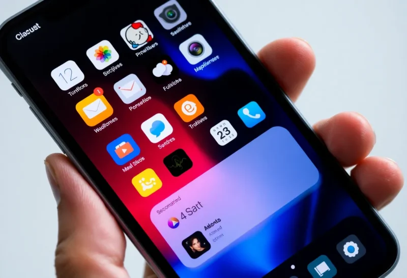
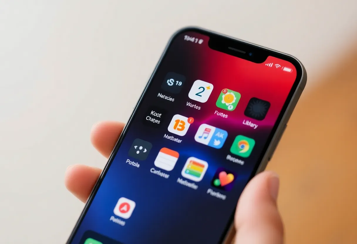
iOS 18 brought more customization than any iOS release in recent memory: tinting the home screen, placing icons anywhere on the grid, a revamped Control Center, a more flexible lock screen. By historical Apple standards, this is a lot. By the standards of what power users have wanted from iOS for years, there are still notable gaps—and they reveal something consistent about how Apple thinks about phone customization versus how serious power users do.
What iOS 18 Actually Got Right
It’s worth being fair before being critical. Several iOS 18 changes are genuinely useful for power users, not just cosmetically satisfying.
The redesigned Control Center is the most significant practical improvement. The ability to add more pages, arrange controls freely with resize options, and remove Apple’s long-locked defaults changes how quickly you can access frequently used functions. For the first time, it’s possible to build a Control Center layout that reflects actual usage patterns rather than Apple’s assumptions about what you probably want. This is the Quick Settings equivalent iOS should have had years ago.
Custom app icon placement—the ability to put icons anywhere on the home screen grid rather than always filling from the top left—sounds trivial but enables real workflow improvements. Placing apps near the bottom of the screen for one-handed reach, leaving visual space as a layout element, grouping related apps in specific screen positions—these are meaningful usability upgrades that power users have worked around with empty apps and blank icons for years.
The expanded Shortcuts automation layer, particularly the new automation triggers added in iOS 18, give power users more programmable control over their devices. Triggers based on time, location, app state, and NFC tag interactions can automate a wider range of phone behaviours than was previously possible without jailbreaking.
The Persistent Gaps
Here’s what iOS 18 still doesn’t do, and why it matters.
Default app assignments are still incomplete. iOS now allows default browsers and email clients—advances that came under regulatory pressure in Europe. But the list of services where you can override Apple defaults remains limited. The default phone app, the default SMS handler, the default maps app for system-level navigation invocations—these are still locked to Apple’s own apps in most regions and contexts. When an app on your iPhone asks to navigate to a location and opens Apple Maps instead of the navigation app you actually use, that’s an iOS limitation that has real daily friction for users who don’t prefer Apple’s defaults.
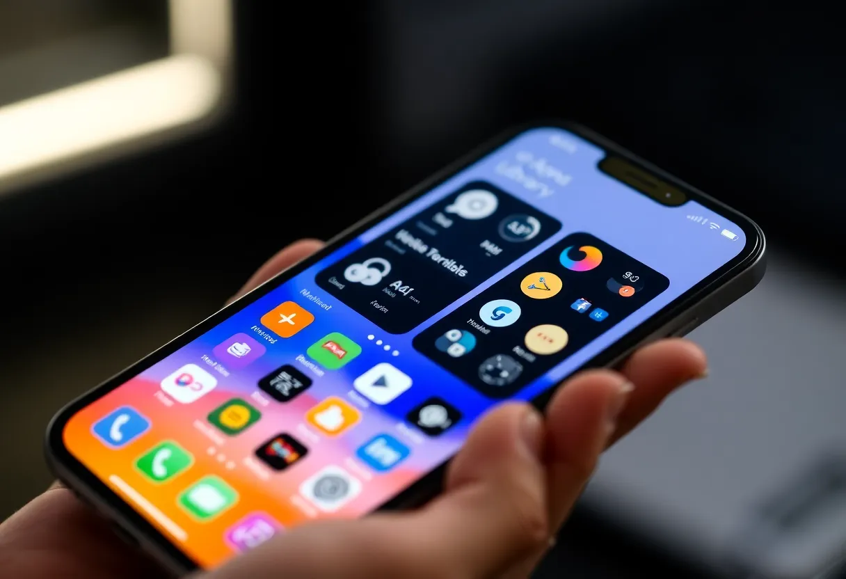
Widget interactivity is still shallow. The lock screen and home screen widgets introduced in iOS 16 and expanded since look polished but remain primarily informational rather than functional. Android’s widget ecosystem—particularly on Samsung and Pixel devices—allows substantially richer interactive widgets that function like mini-app interfaces. On iOS, widgets show data and launch you into the app; they rarely let you do things without that app-launch step. For a workflow designed around quick task capture, timer management, or music control without leaving what you’re doing, this limitation adds up.
The home screen still enforces a single visual paradigm. Despite free icon placement, all iOS home screens still show a wallpaper with floating icons in a fixed grid cell size. Android launchers can present completely different interaction models: app drawers, widget-only screens, gesture-based launchers, minimal screens with no icons visible by default. iOS doesn’t allow third-party launchers and the system launcher offers one way to organise apps. For users who have genuinely different mental models of how they want to organise and access their apps, this is a real constraint.
Automation still requires confirmation for many actions. iOS Shortcuts are powerful, but certain action types—sending messages, making calls, deleting content—require user confirmation even when triggered by automations you’ve specifically set up. The security rationale is understandable, but it means automations that should be silent background actions require tapping “OK” to proceed, defeating the “automated” part. Android’s automation apps (Tasker, Macrodroid) can be configured to perform these actions silently once explicitly permitted. iOS automation feels like it’s been designed to look capable on demos while being cautious enough that it doesn’t surprise users who didn’t mean to set something up.
Split view and multitasking remain iPad-only. Running two apps simultaneously, referencing a document while writing notes, monitoring a dashboard while responding to messages—on iOS for iPhone, these still require app switching rather than true multitasking. Apple’s reasoning (screen size) is somewhat valid for the smallest iPhones but increasingly unconvincing for the Pro Max, which is a large device. Android has had split-screen on phones for years, including on comparably-sized displays.
Why Apple Designs This Way
These gaps aren’t accidents. They reflect a consistent design philosophy that prioritises simplicity, safety, and the median user experience over power user flexibility—and Apple has been extremely deliberate about it.
Apple’s position is that every customization option is a potential source of confusion. If home screen layouts can be arbitrarily different, the “where did my apps go?” support burden increases. If widgets can do anything, a badly-designed widget can make the phone feel broken. If automations can act without confirmation, an accidentally set trigger can do something unintended. The constraints are features for Apple’s target market, even when they’re frustrations for power users.
This isn’t entirely cynical. There’s genuine evidence that many iOS users—particularly older users and users who didn’t come from technology-forward backgrounds—benefit from an environment that’s less easy to accidentally misconfigure. The simplicity Apple maintains is part of what makes iOS accessible to demographics that find Android’s flexibility overwhelming.
The problem is that “designed for simplicity” and “capable of power use” don’t have to be mutually exclusive. Android manages to support both via the combination of a sensible default experience and deep configurability for those who want it. Apple’s persistent position that power user features undermine the overall experience is increasingly hard to defend when Android demonstrates that both can coexist.
The Workaround Landscape
Power users on iOS have developed a substantial ecosystem of workarounds, and understanding them is part of understanding what iOS is missing.
Shortcuts workflows fill many of the gaps that the OS itself leaves open. A well-built Shortcuts library can automate home screen management, batch-process photos, connect apps that don’t officially integrate, and build personalised widgets via third-party widget apps like Scriptable. The sophistication of the power user Shortcuts community—sharing workflows on Reddit, MacStories, and YouTube—is essentially a market signal about unmet demand for iOS configurability.
Third-party keyboard apps extend typing capabilities meaningfully—better autocorrect, gesture typing, custom key layouts, clipboard management. These are allowed on iOS but still have limitations (system text fields sometimes revert to the default keyboard, certain secure input fields don’t allow third-party keyboards at all).
Launch Center Pro and similar apps partially address the “quick action launcher” gap by providing configurable trigger-based quick access to apps, contacts, shortcuts, and system settings. The fact that this category of app exists and has a dedicated user base is another indicator of what iOS natively lacks.
Where iOS Genuinely Wins for Power Users
Despite the frustrations, iOS has real advantages for power users that Android’s greater flexibility doesn’t overcome for everyone.
The Apple ecosystem integration is genuinely seamless in ways that matter: Handoff between iPhone and Mac, Universal Clipboard, AirDrop reliability, iMessage sync across devices, the quality of Apple-native apps like Notes, Reminders, and Files for users who build workflows around them. For a user deeply in the Apple ecosystem working on multiple Apple devices, the friction of iOS’s limitations is offset by ecosystem advantages that Android doesn’t fully replicate.
The developer tooling for iOS automation—Shortcuts, the Files app, third-party scripting apps—while limited compared to what’s possible on a rooted Android, is better integrated and more stable than many Android automation setups. A Shortcuts workflow that works today will almost certainly still work after the next iOS update; the same guarantee isn’t always true of the Android automation ecosystem.
Performance and update consistency matter to power users who use their phones hard. The A-series chip performance headroom means iOS feels fast even under demanding automation and multi-app workflows, and the update consistency—five or more years of software support, delivered promptly to all compatible devices—means you’re not managing update fragmentation on your primary device.
The Realistic Assessment
iOS 18 is meaningfully better than iOS 17 for power users. Apple is clearly listening to feedback about customization and incrementally responding. The direction is right.
But the underlying philosophy hasn’t changed: Apple will give power users capabilities up to the point where those capabilities risk complicating the experience for less engaged users, and no further. Default app restrictions, limited widget interactivity, shallow automation permissions, and the absence of third-party launchers all reflect this boundary.
If you’re a power user evaluating iOS 18: the phone is more configurable than it’s ever been, and the additions are worth using. If you’ve been waiting for iOS to match Android’s flexibility in ways that matter to your specific workflow, the wait continues. Apple is moving in the right direction at Apple pace—which has never been the same pace as power users would choose.