Console OS Design: Why PlayStation and Xbox Feel So Different

Marcus Webb
March 15, 2026

Turn on a PlayStation and then an Xbox and you’re not just switching hardware—you’re switching philosophy. The two consoles do similar things: play games, stream media, run apps. But the way they organise the experience, surface content, and prioritise what you see first is radically different. That’s console OS design: the layer between you and the games. Here’s why PlayStation and Xbox feel so different, and what that tells us about how each company thinks you should use the box under your TV.
PlayStation: Games First
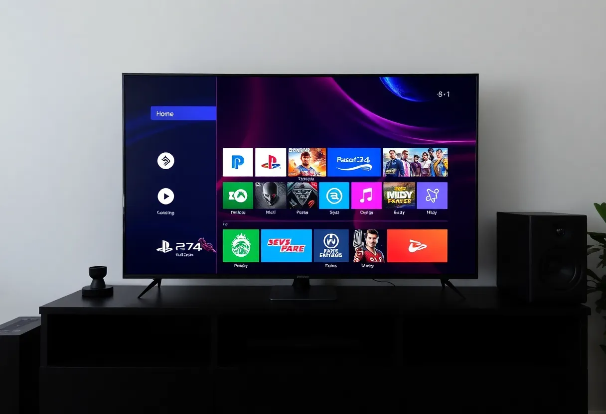
Sony’s approach has been to put the game front and centre. When you boot a PlayStation, you land on a horizontal row of your recent games and activities. The home screen is built around the idea that you’re here to play something—and the system tries to get you into a game or back into one you had open with as few steps as possible. Media apps (Netflix, Spotify, etc.) are there, but they’re not the default focus. The visual language is clean and game-centric: big art, clear icons, and a structure that assumes the primary use case is “launch or resume a game.” That’s reflected in the way trophies, friends, and parties are integrated: they’re part of the gaming layer, not buried in a separate “social” app. The OS feels like it’s saying: this is a games machine that can do other things, not an entertainment hub that also plays games.
Xbox: Hub and Ecosystem
Microsoft has taken a different path. The Xbox dashboard has evolved into a broader entertainment and ecosystem hub. There are more tiles, more sections, and more emphasis on discovery: Game Pass, store, social, and media sit alongside your recent games. The home screen can feel busier—there’s more to look at, more to scroll through. That’s by design. Xbox is tied to a larger Microsoft ecosystem: your account, your subscriptions, your PC and cloud gaming. So the OS is built to surface not just “your game” but “what you might want next” and “what’s happening in the ecosystem.” It’s a games machine that’s also trying to be your gateway to a subscription library, friends list, and cross-device identity. The trade-off is that the path to “just play” can feel longer than on PlayStation, but the path to “discover something new” or “check what’s on Game Pass” is shorter. Microsoft has also pushed the dashboard toward content and promotions—Game Pass highlights, store deals, and sometimes ads—which keeps the screen dynamic but can feel noisy if you only want to resume a game.
Why the Difference Matters
Console OS design isn’t just cosmetic. It shapes how you use the device every time you turn it on. If the default view is “your last game,” you’re more likely to jump straight back in. If the default view is “here’s a row of suggestions and subscriptions,” you’re more likely to browse. That affects engagement, retention, and how much time you spend in the OS versus in a game. Both approaches are valid: Sony is optimising for the player who knows what they want; Microsoft is optimising for the player who might want to explore or who is deeply in the Xbox/Game Pass ecosystem. The same hardware category, two different product philosophies.
Updates and Iteration
Both UIs have changed over the years. PlayStation has refined its horizontal, game-first layout across PS4 and PS5; Xbox has gone through several dashboard revamps, sometimes to criticism (too many ads, too cluttered) and sometimes to praise (better Game Pass integration, faster). The fact that both companies keep iterating suggests that neither has found a “perfect” formula—and that the balance between “get me into a game” and “show me what’s available” is a moving target. What’s consistent is the underlying split: Sony leans into “console as dedicated games device,” Microsoft leans into “console as node in a larger service and identity network.” Your preference for one or the other often comes down to whether you want the OS to get out of the way or to actively suggest what to do next.
Settings, Store, and the Rest
Beyond the home screen, the two diverge in how they handle settings, the store, and system-level features. PlayStation tends to tuck system settings and store access behind a top bar or a long press; the idea is to keep the main view about games. Xbox often surfaces store and subscription content more prominently, so you’re never far from a prompt to browse or buy. Neither approach is inherently better—it depends whether you see the console as a focused gaming device or as an entertainment hub that includes games. The same split shows up in how each handles quick resume, parties, and notifications: Sony keeps a lot of that in a side panel or overlay so the game stays central; Xbox weaves more of it into the main dashboard. So the “feel” isn’t just the first screen; it’s the whole flow of how you get from power-on to playing, and how much the OS asks for your attention along the way.
The Takeaway
PlayStation and Xbox feel different because they’re designed around different assumptions. One puts the game first and keeps the rest in the background; the other puts the ecosystem and discovery front and centre. Neither is wrong—they’re just optimised for different use cases and different kinds of players. So the next time you switch between them and feel a bit disoriented, it’s not just habit; it’s the OS telling you what each company thinks you’re there for.


